
Redesigning an ecommerce website and app, focused on sports and cycling/outdoor products.
Wiggle
Overview
Wiggle and Chain Reaction are leading brands in the cycling eCommerce space, with a combined following of over 300k. However, outdated tech and years of neglect left the platform in need of a full redesign to maintain industry leadership.
As a UX Designer at Wiggle, I collaborated within a cross-functional team of designers, BAs, scrum masters, and developers. Working in agile design sprints, I was responsible for revamping the ‘My Account’ section — a key area for improving user retention, satisfaction, and revenue performance.
↑ 60%
Faster Navigation,
on new website
↓ 30%
buyers, extended after the redesign.
+ £1M
Annual Revenue increase through prototypes.
x8.3
increase in repeat purchases.
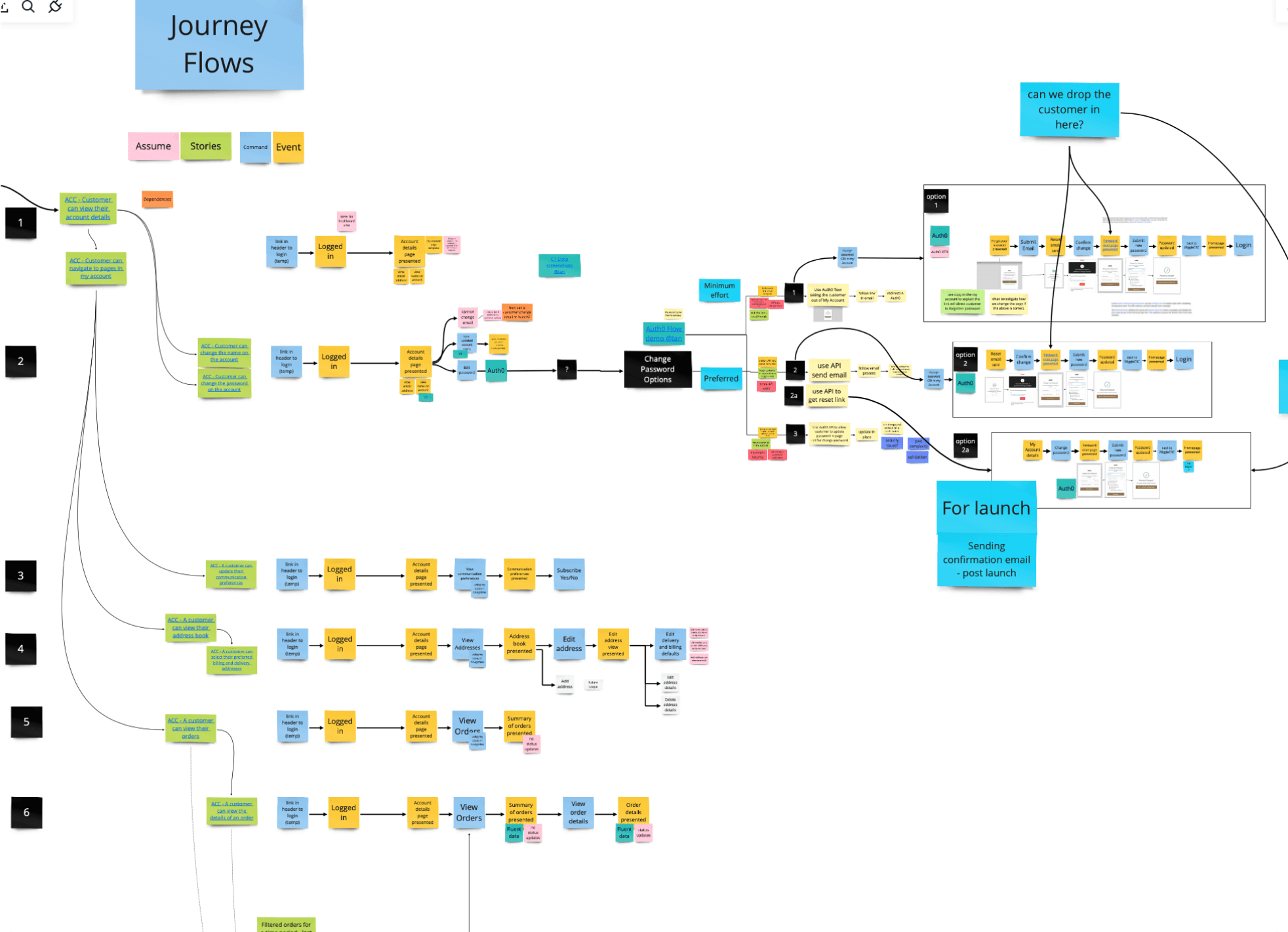
User journey
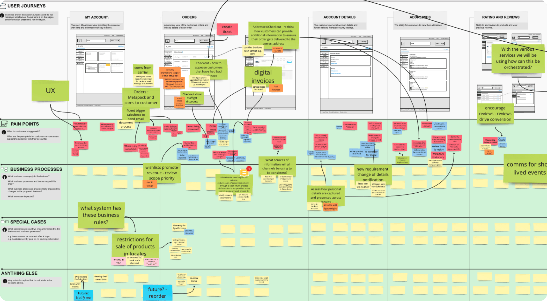
We mapped each page within ‘My Account’, identifying user pain points and aligning them with stakeholder and business requirements. We also defined key business procedures and how they impact user experience. Special cases were noted where operational needs overrode ideal UX due to logistical constraints.
Pain point mapping
We mapped user pain points across key account journeys to identify friction, drop-off triggers, and missed opportunities for engagement. This shows an example of a map created that shows what the user would feel when looking for an order.
User has to log in to website
A new screen is introduced a left menu appears with ‘my orders’
user has to navigate to my account section
User sees last order at top of page
User needs to see last order
“Trying to find the specific
Info im looking for is hard”
“I’t took me a while to really
understand what I can do in this
section.”
“The cards seem randomly placed, I tend to guess the page im looking for”
“It would be good to see some information related to what I have done in the past”
Interviews
To find out first hand how users felt when browsing the My accounts section, we interviewed 10 users of wiggle.

Build a new my accounts section to increase user satisfaction and to take the weight of wiggles phonelines, when lost users call in.
What is needed...
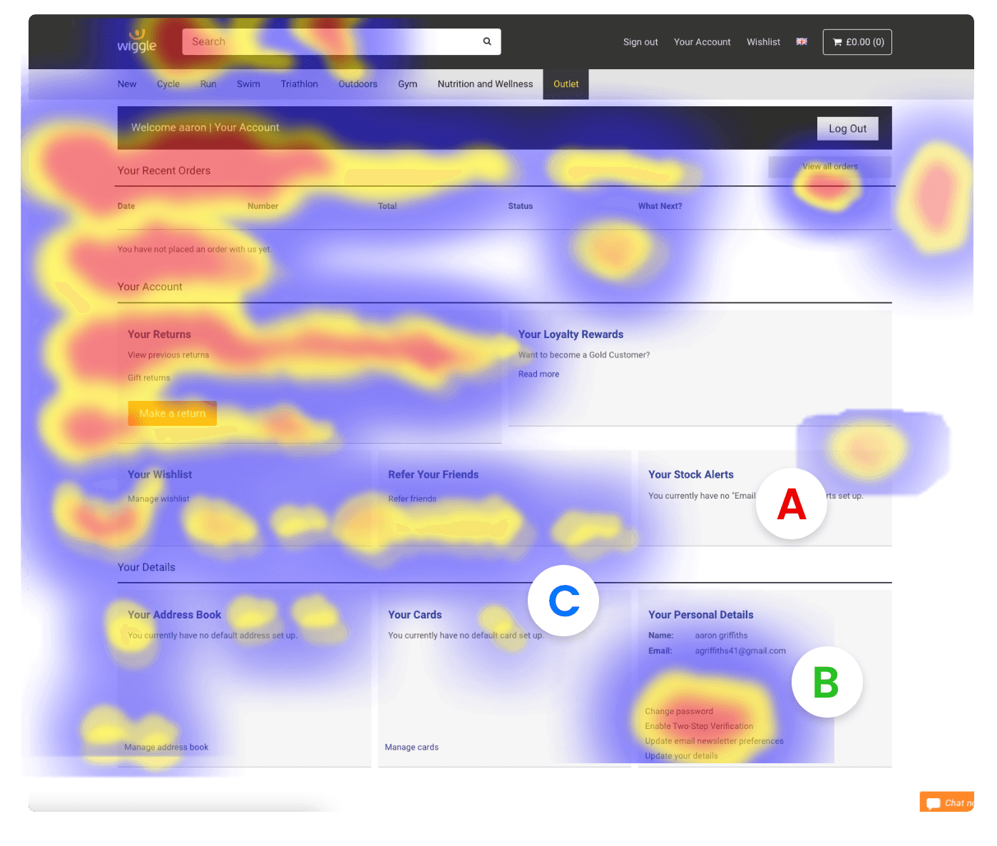
Stock alerts have low clicks - shows users have little interest in this.
A: Least clicked (stock alerts)
Users come here the most, meaning this is an opportunity to enhance this.
B: Most clicked (Your details)
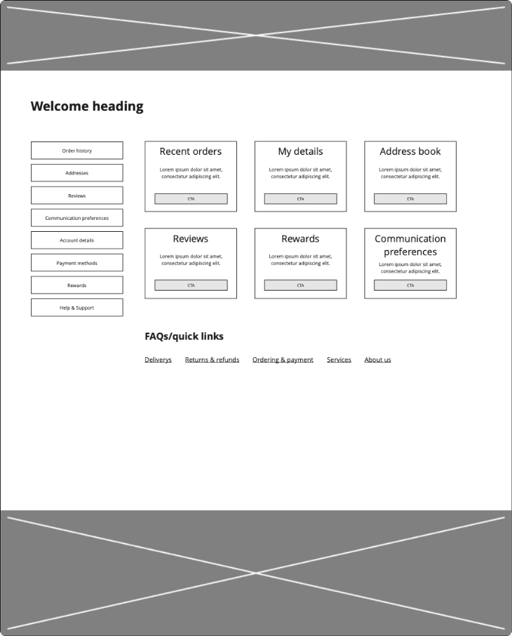
It is clear that users believe the whole card is clickable, to prevent misclicks in the future, the entire card can be clickable.
C: Misclicks
No directly valuable information for users that land here.
No valuable content
Cards are large causing the user to scan further across to see next card.
Poor use of space
Components nave grouping, though this is not immediately clear. User would not know where to look to find something they are looking for.
Arrangement
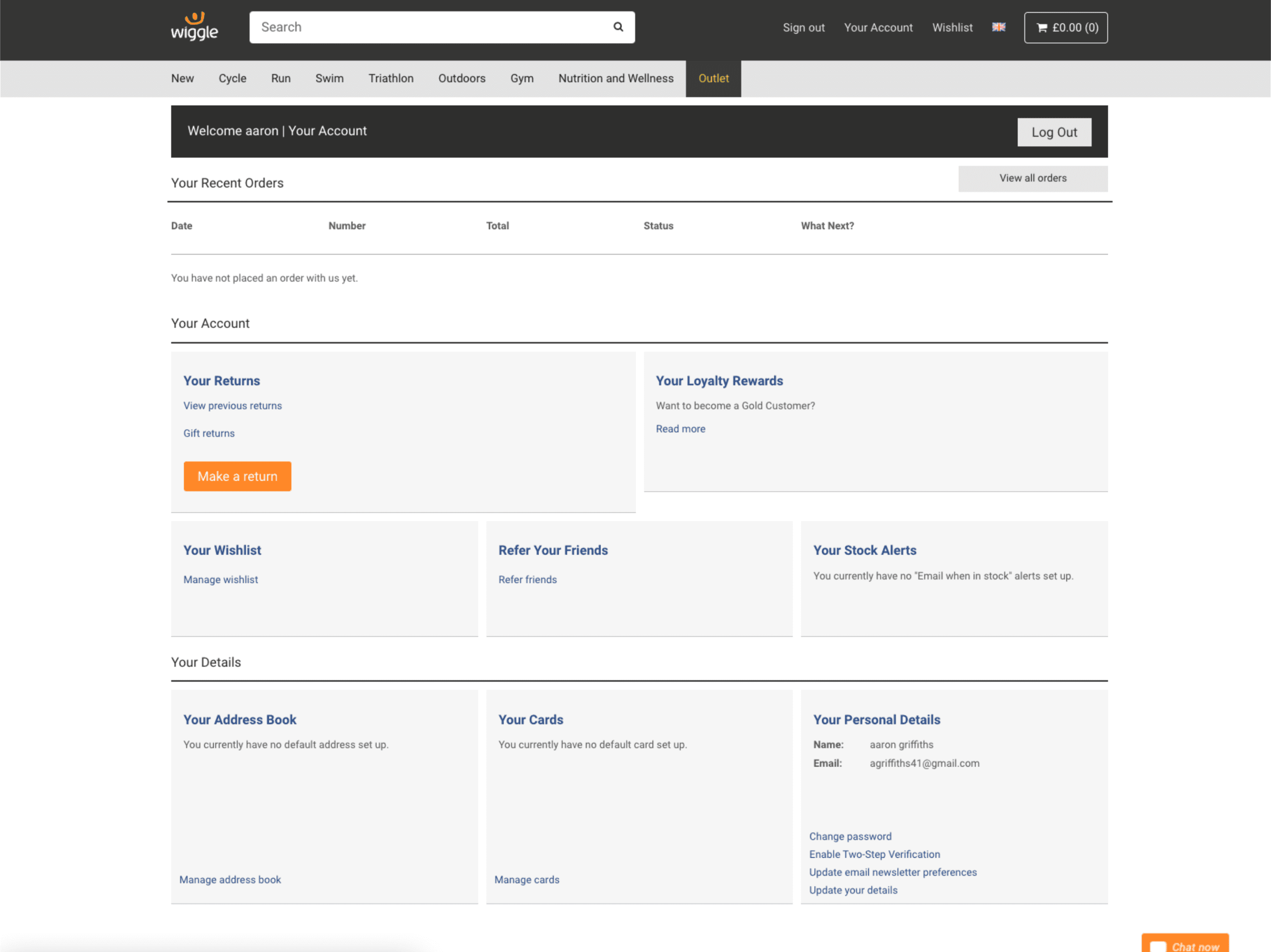
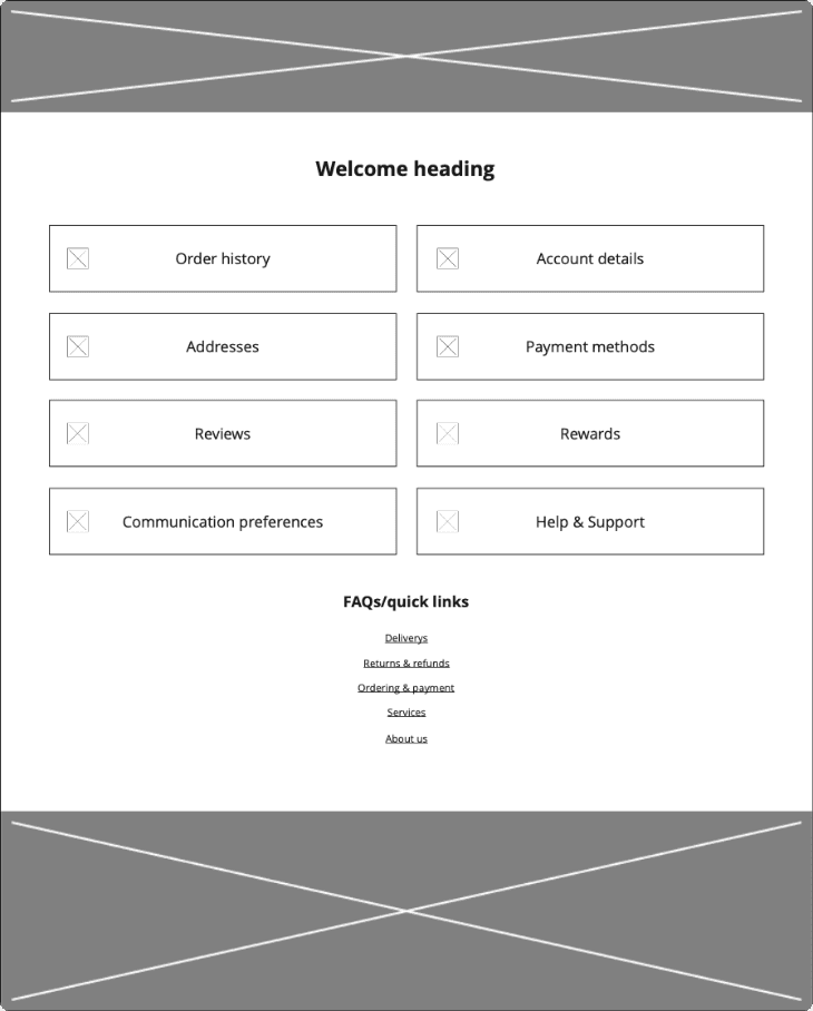
My account analysis
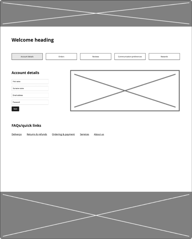
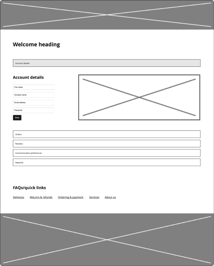
Initial mockups
Quick calculated mockups were put together using the obtained data and were then shared with the design team. Feedback was and a vote for the best one was given.
Is there a visible reward system or exclusive member perks in the account area?


Features
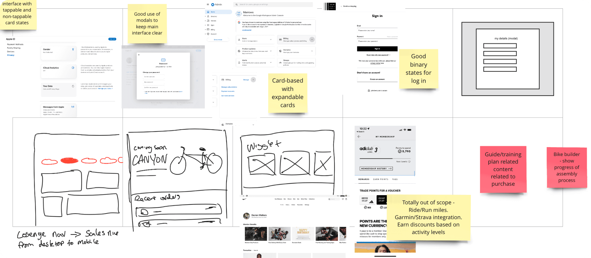
Competitive Analysis
Is the "My Account" area easy to navigate with clear order history, preferences, and personal details?
Do they offer seamless delivery or click & collect options with clear tracking?
Does the platform tailor suggestions based on user behaviour or past purchases?
Are user reviews and ratings easy to find, filter, and trust?

Ideation
We collated the research and summarised our findings with potential solutions on post it notes. Similar cards were matched and a title was given. This showed us where each piece of data,solution or idea should be placed or factored in.
All findings were shared with the team. We all shared either a mockup or analysis starting in box 1 then moving to the next box, iterating on what was in the last box. This filled in any missing gaps in research while obtaining knowledge and best practices from team mates.
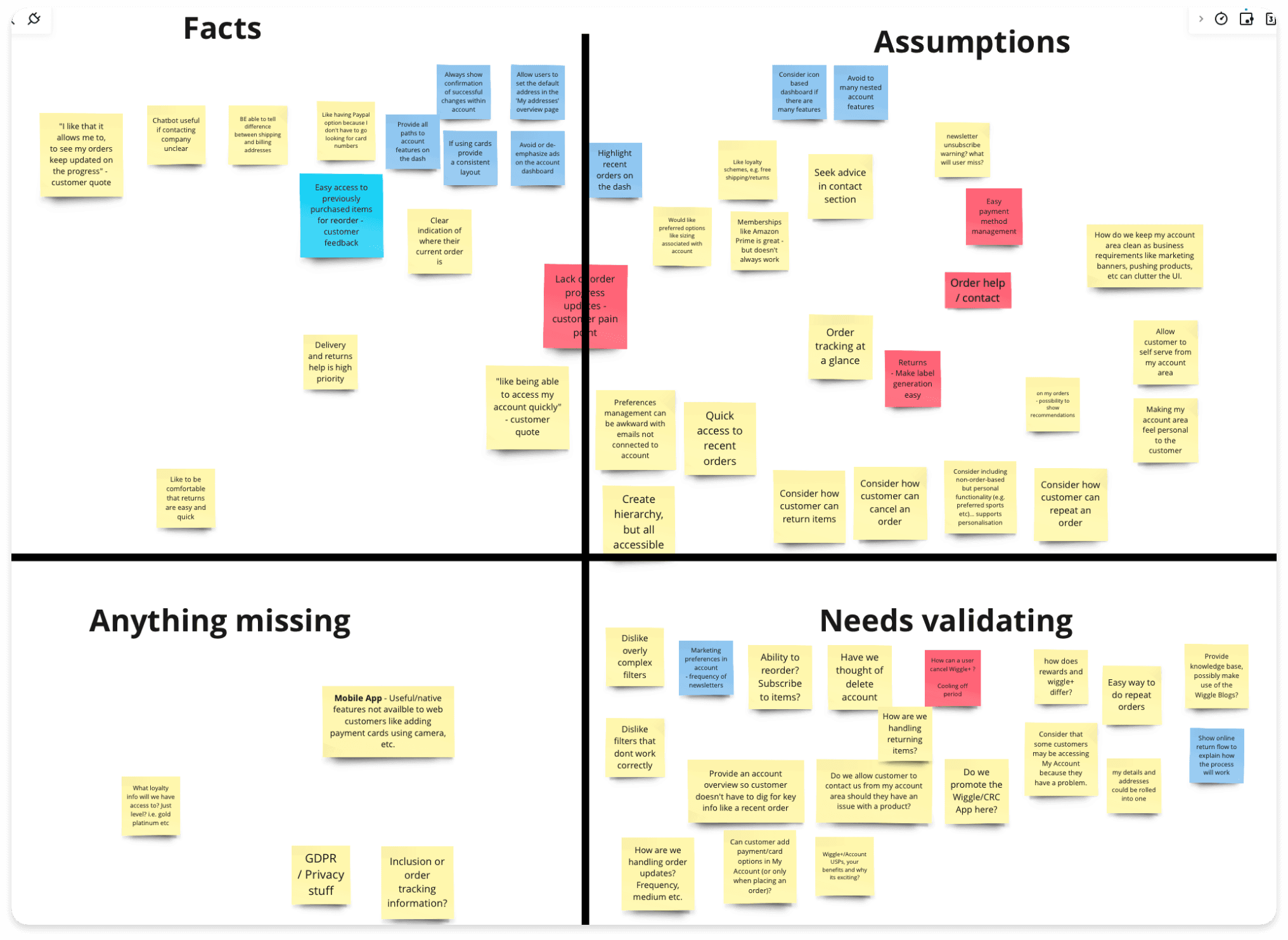
Everything known in terms of customers, design best practice, requirements, questions and goal related insights were written on stickies, then were grouped as facts, assumptions, anything missing or needs validating. Strengthening research areas to cover in the future.
To give a realistic picture of what the user would see and the best path taken, journey flows were created. This also lets us know the fitment of each screen and pain points users may have as they browse early on.
Overview
The revamp was not only well needed, but also well received. During feedback sessions users noted how it was easy to see important information at a glance, in the past users would have to click in to see details. An overall success.
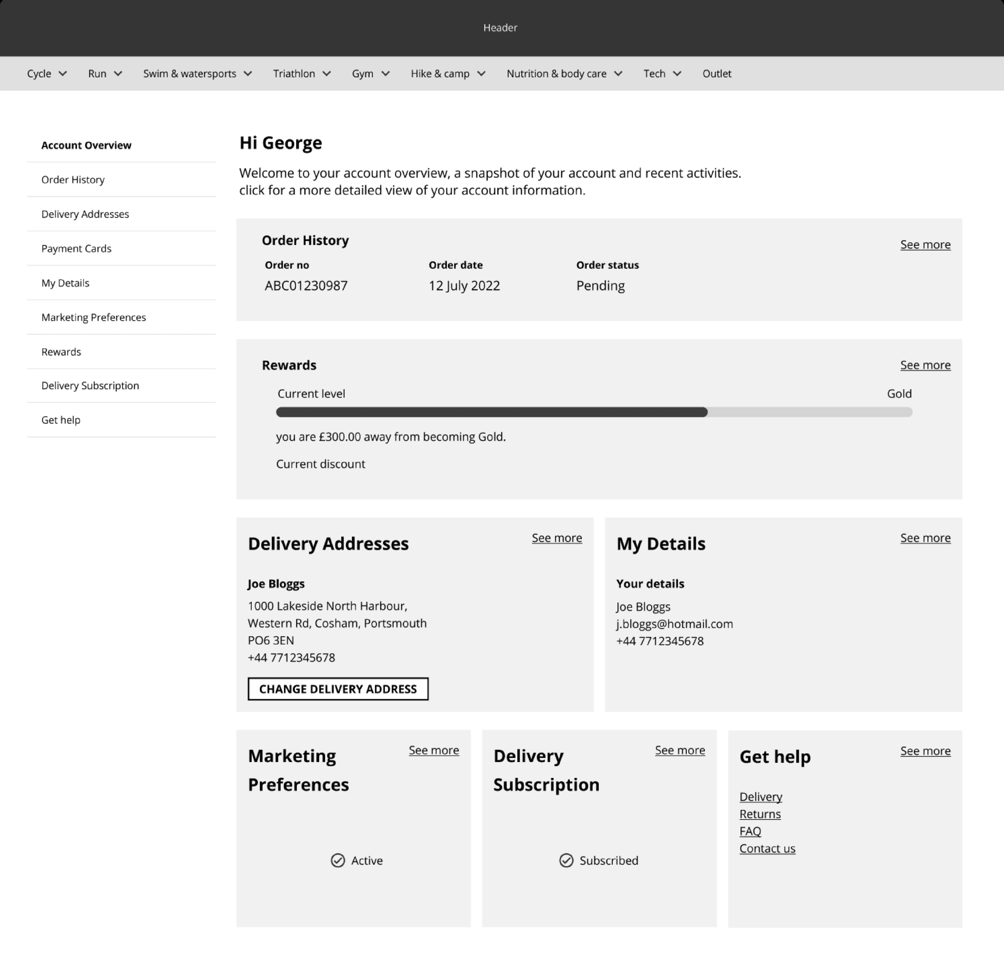
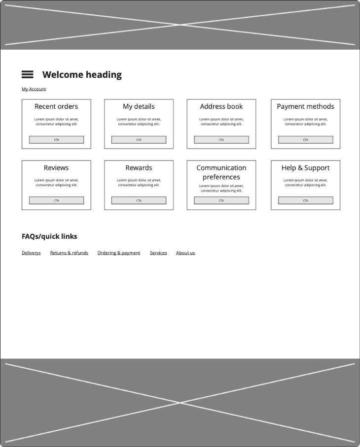
Final interface
The final prototype brought together all validated design decisions into a cohesive, user-centred interface. It was built to reflect real user flows, showcasing streamlined navigation, refined content hierarchy, and key features prioritised through stakeholder and user input. This clickable prototype was used to demonstrate functionality, gather final feedback, and guide development during handover.
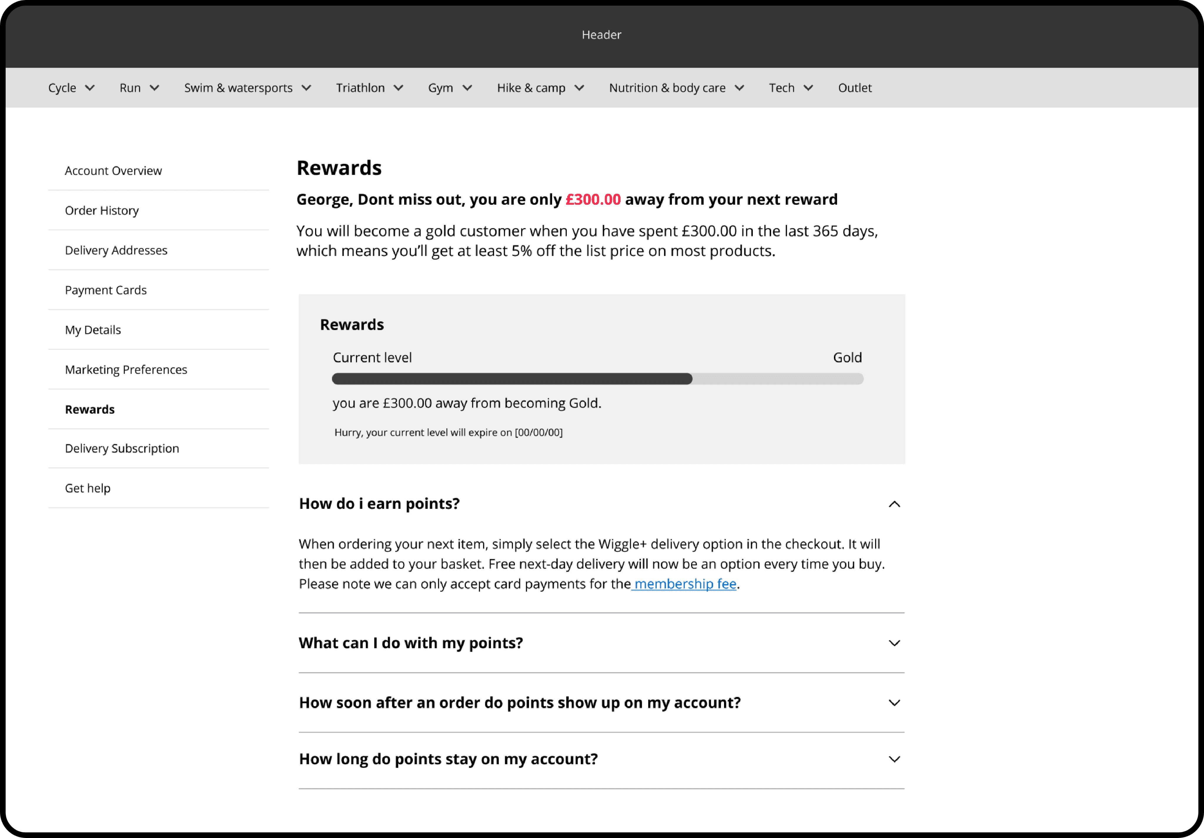
Rewards was an area to capitalise on. Members have a breakdown of how close they are, with an answer for questions being close by.
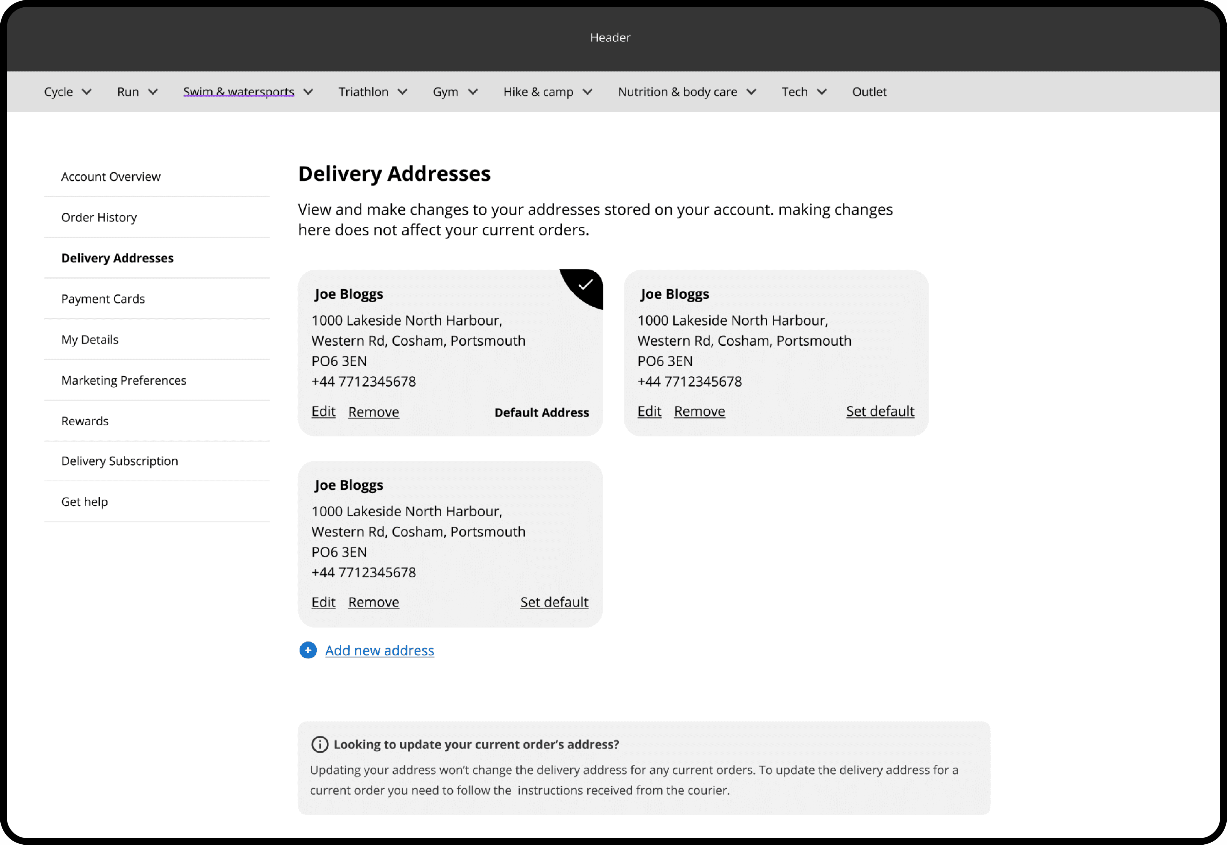
All delivery addresses are shown, 1 click allows the user to change delivery address and make changes.
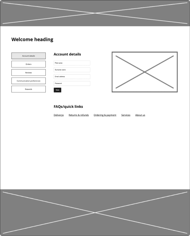
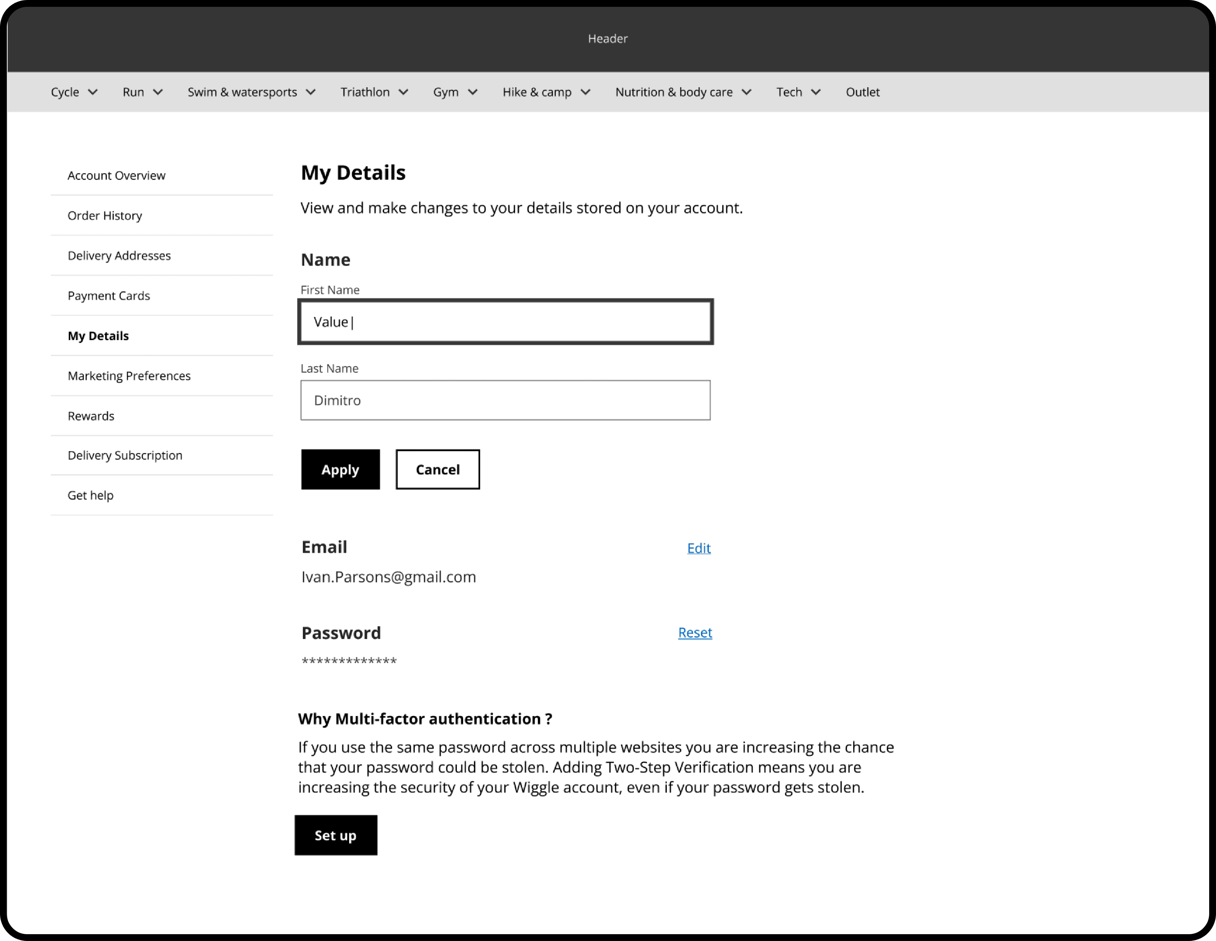
Details can be edited quickly from the simple my details screen. Changes take effect after hitting apply, to work as an undo function if errors occur.
https://algdesigns.co.uk/autolomous