Creating a functional easy to use
CRM platform for sales executives
Datles
Overview
Datles is a next-gen CRM platform built to remove the friction of traditional sales tools. I led a two-person design team, collaborating with users to define requirements, conducting user research, and delivering a prototype that met both executive expectations and stakeholder goals. My focus on clear team coordination and iterative feedback ensured delivery within a tight timeframe.
100%
of buyers, extended after the redesign
100%
of buyers, extended after the redesign
100%
of buyers, extended after the redesign
100%
of buyers, extended after the redesign
Surveys
28 people were surveyed to see how the felt about current CRM’s. We also asked for their most used feature, this being content management, followed by analytics.
Participants
28
Questions
12
of users said their current CRM slows down their daily workflow.
Tool Frustration
76%
want faster ways to log or view recent client interactions.
Top User Need
81%
say they waste over an hour daily switching between tools to complete sales tasks
Workflow Bottleneck
66%
Decisions
We decided to prioritise a clean, intuitive interface with quick access to recent activity. Reducing context switching became key to improving daily efficiency for sales executives.
Interviews
Interviews were key for finding out the problems in greater detail. Answers from surveys would help create the questions asked.
“I have to use three different tools just to prep for a client meeting.”

“I have to use three different tools just to prep for a client meeting.”

“I just want to see my recent activity and pick up where I left off.”

“Half the features I never use — they just get in the way.”

Features
Feature name to go
here
Feature name to go
here
Feature name to go
Feature name to go
here
Feature name to go
here
Feature name to go
here
Features
Quick access to recent activity
Inline editing from dashboard
Customisable pipeline stages
One-click task creation
Clear, uncluttered UI


Analysis
Following the competitive analysis, it was clear that existing CRMs lacked simplicity and speed — reinforcing our decision to focus on a streamlined, user-first experience.
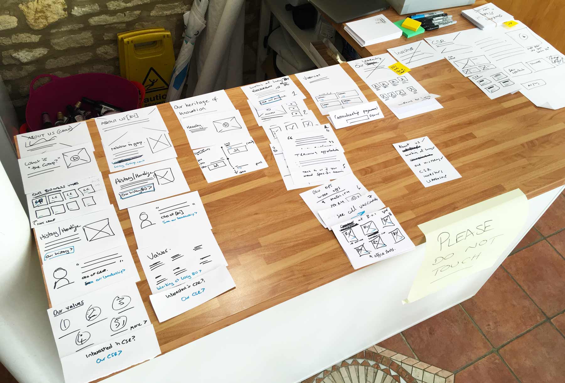
Ideation
During the ideation phase, we rapidly sketched low-fidelity paper mockups to explore multiple interaction models and layout possibilities. These early concepts were used in collaborative design reviews with stakeholders and iteratively refined through design critique sessions. The goal was to validate core user flows and align the direction with both user needs and business objectives before moving into digital wireframes.
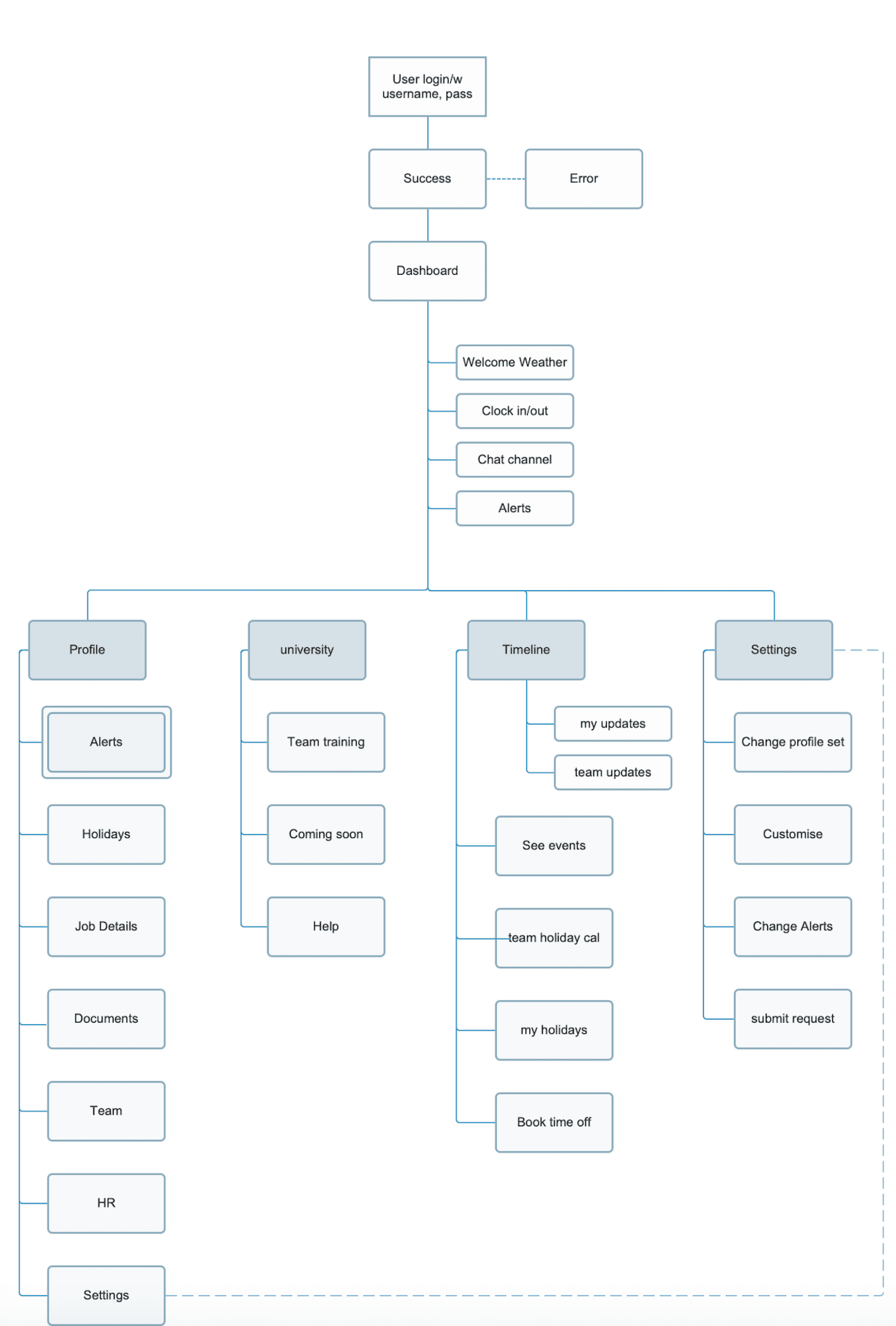
Sitemap
The site map was developed as part of our information architecture planning to establish a clear content hierarchy and optimise task flow. By mapping out primary and secondary navigation paths, we ensured intuitive access to core features like pipelines, client records, and task management. This structure reduced cognitive load, supported user mental models, and provided a scalable foundation for future feature expansion.
Mockups were created and A/B tested within our user group to gain a better understanding in how users will interact with product
Testing
Dashboard A: Variation
Mockups were created and A/B tested within our user group to gain a better understanding in how users will interact with product
20%
A once leader in print magazine for accountants, Accountancy daily was on the verge of being axed due to readers moving to a digital news. Us designers were tasked with bringing more value to the product. A team of 2, as a UX/UI designer,
A once leader in print magazine for accountants, Accountancy daily was on the verge of being axed
Dashboard B: Variation
80%
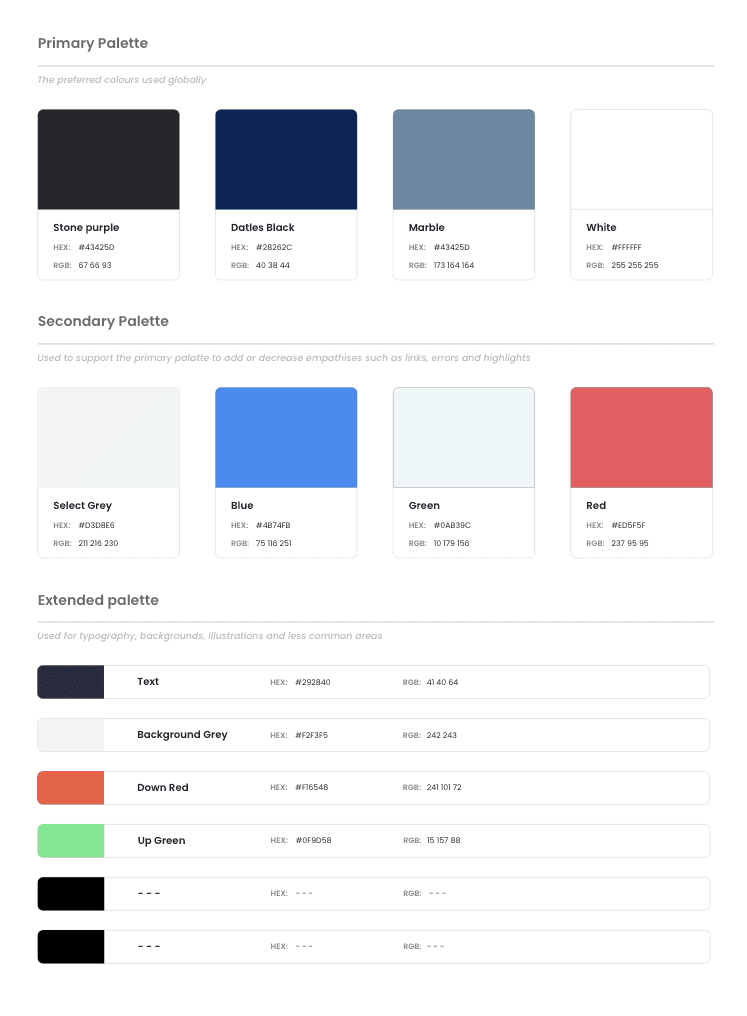
Design system
As this was a start up aiming to have many products, creating consistency early on was vital so a design system was built. This also scoped the brand guidelines.
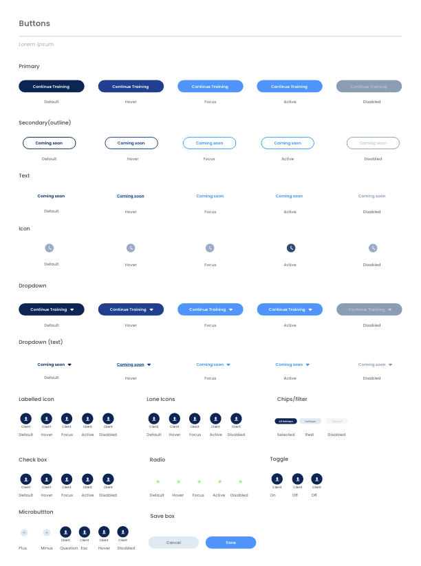


Buttons
Buttons
Colours
Menu
Popover

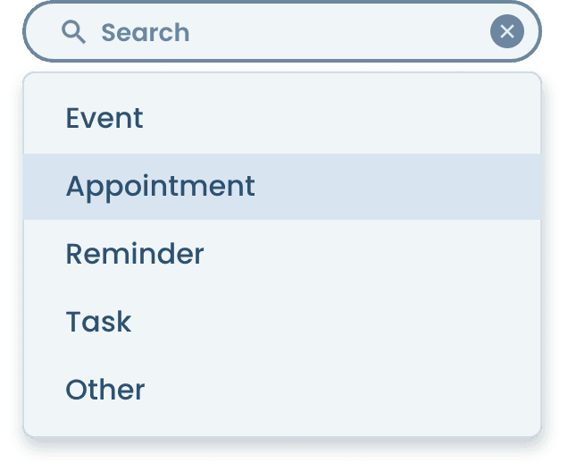
Search
Logos
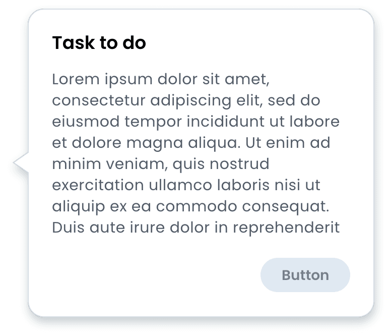
Cards
Forms
Overview
Overall the project was a success. When testing in a real life scenario with a sales executive on the phone, they were able to use the software effectively, with little training on the product. Datles was able to provide the software to clients all over the world, which lead to funding for a product focused on team training. Over time updates and new features were brought into the product, enhancing the software further.
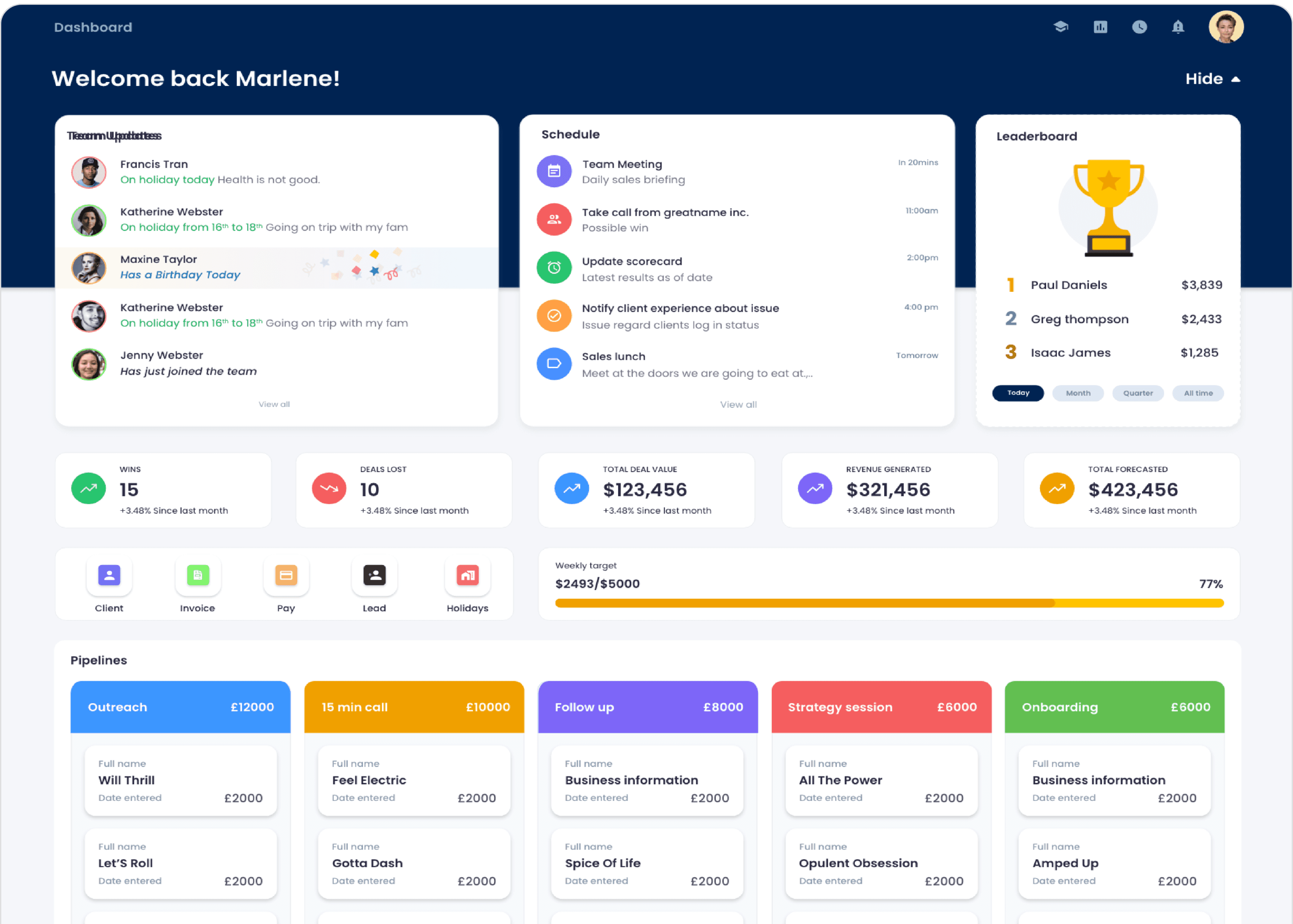
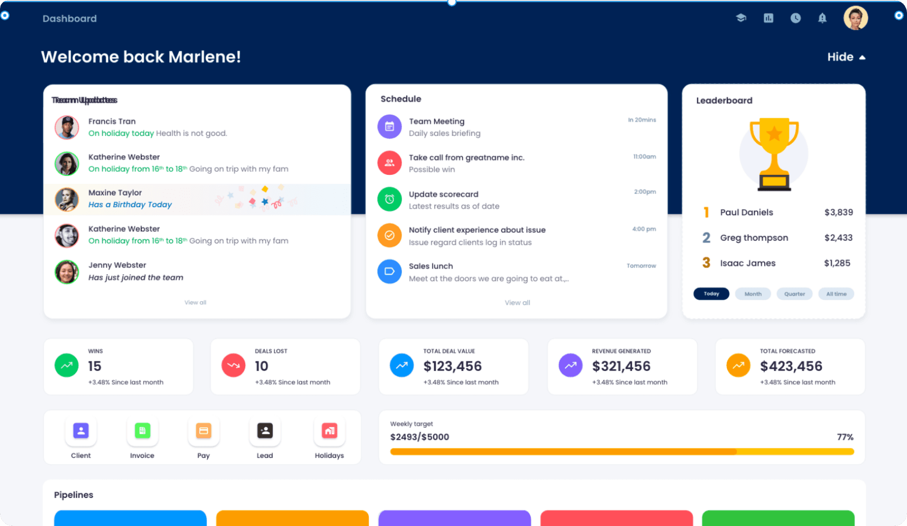
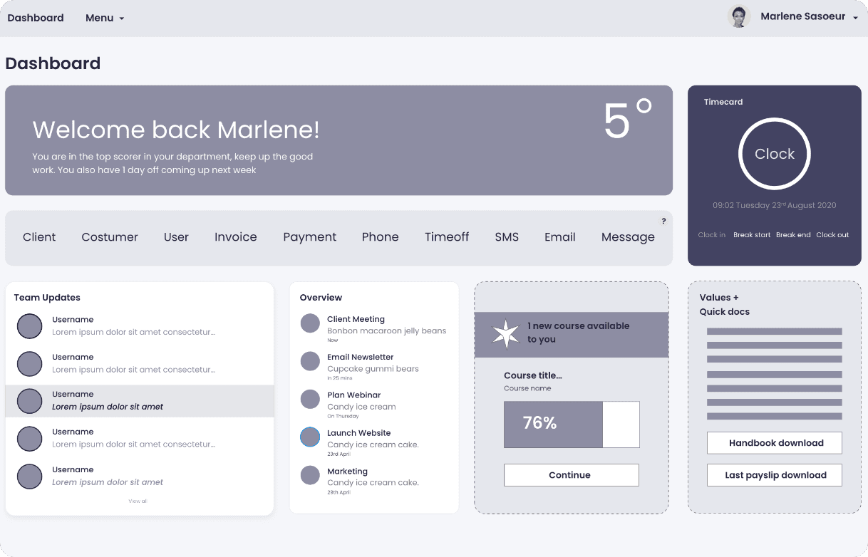
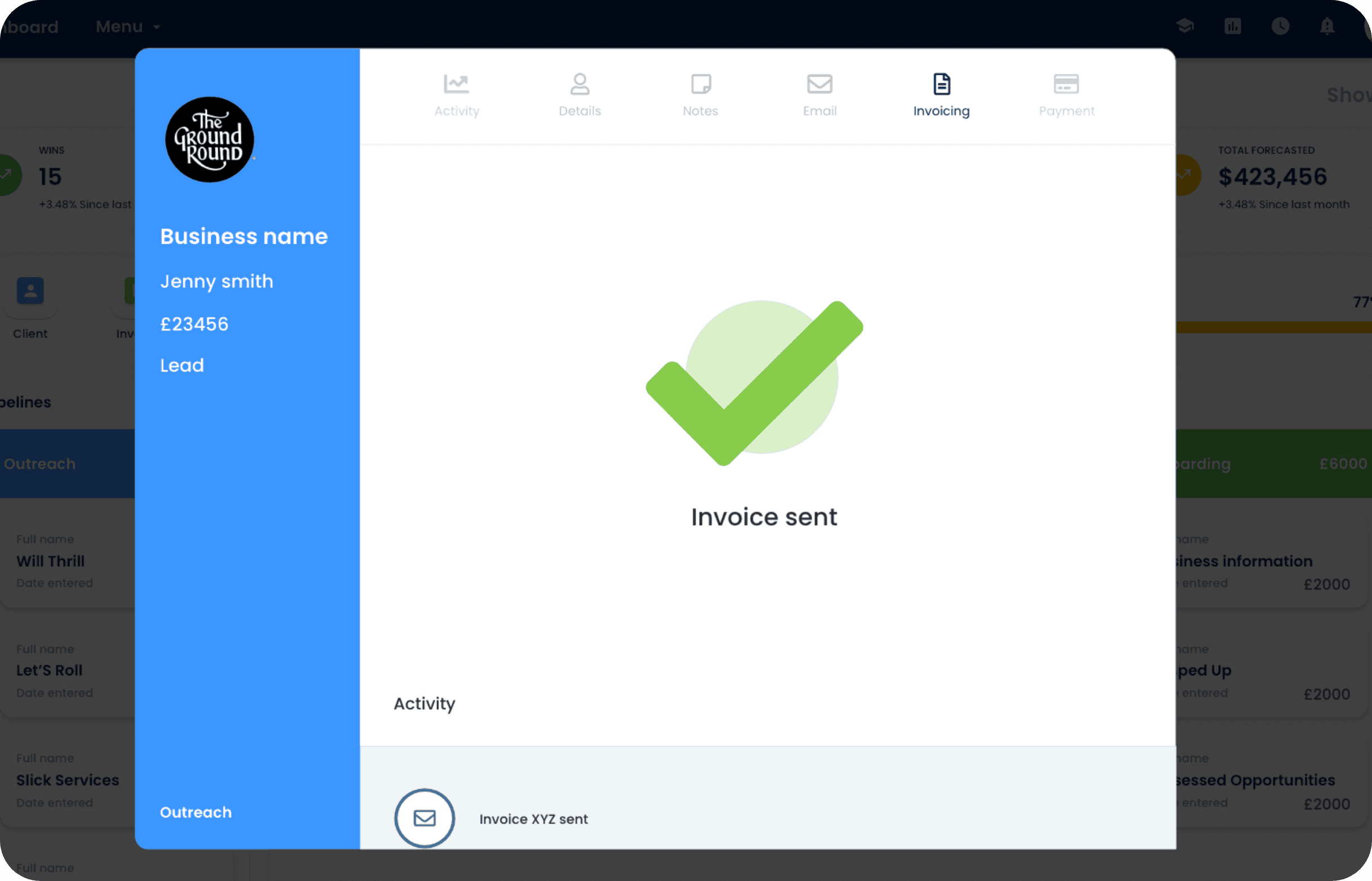
Final interface
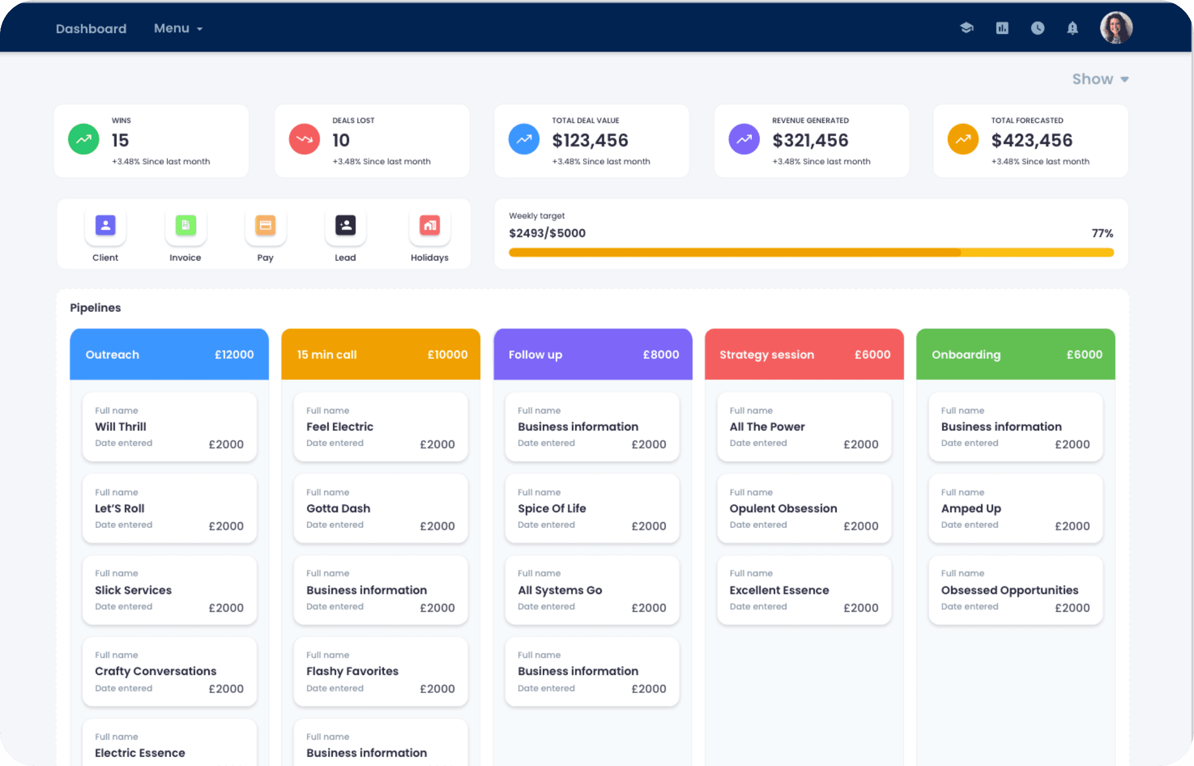
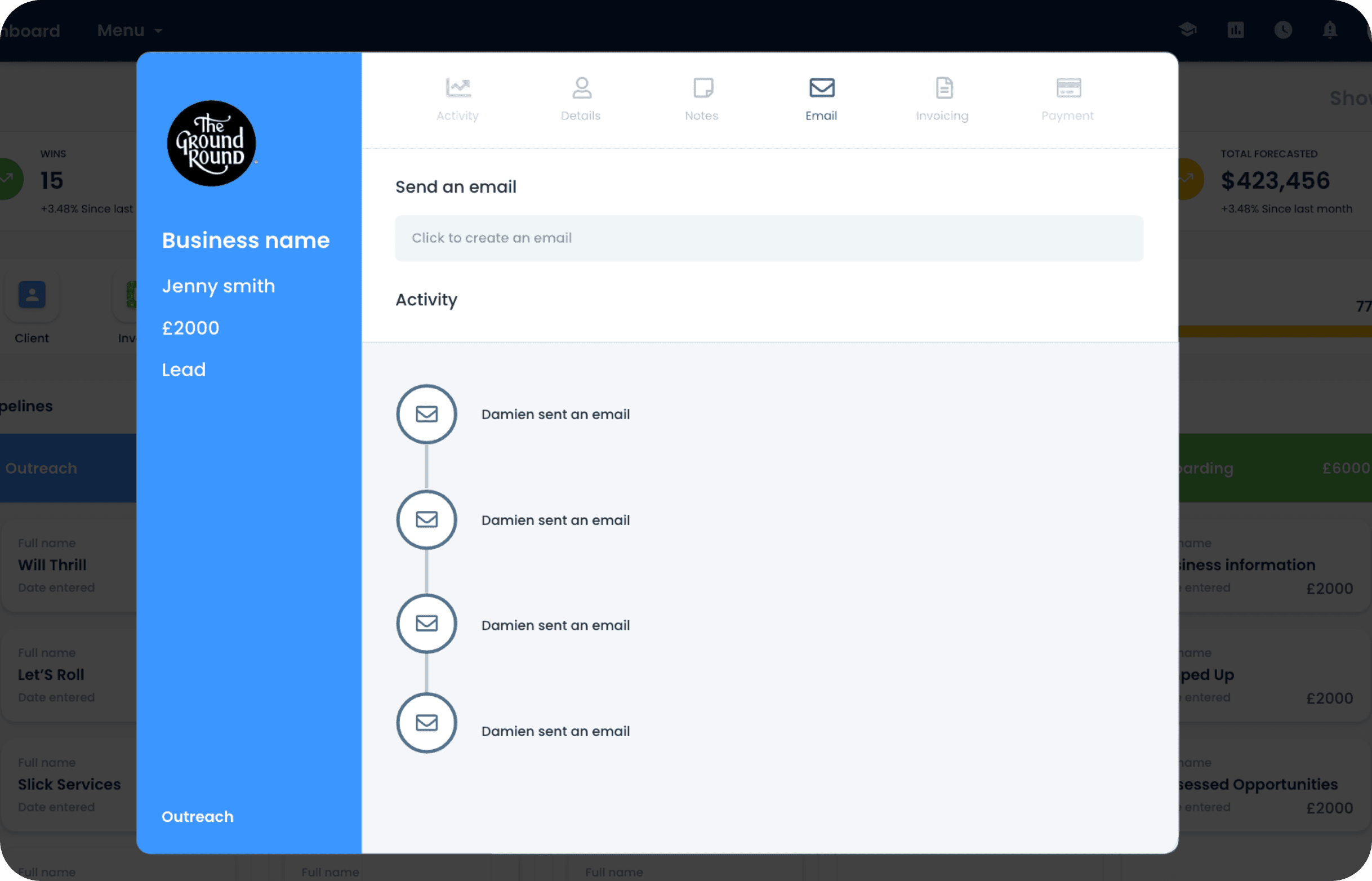
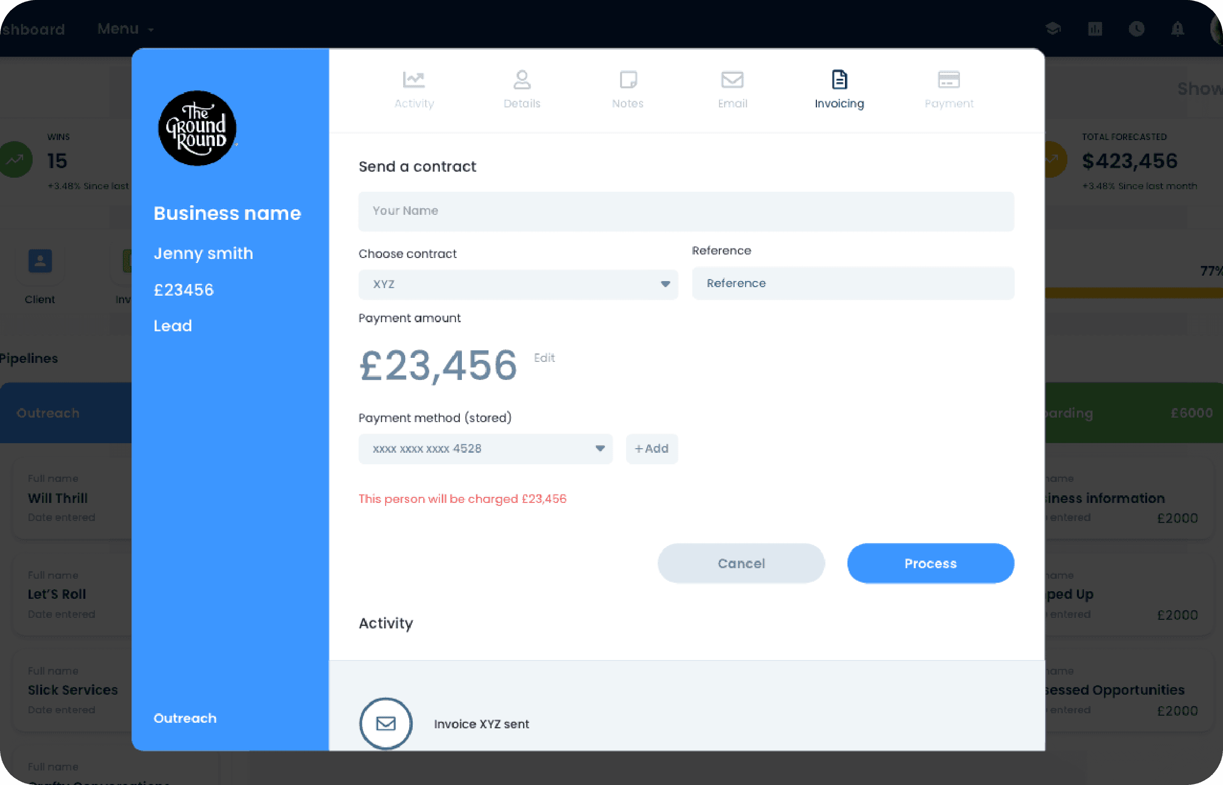
The final prototype brought together all validated design decisions into a cohesive, user-centred interface. It was built to reflect real user flows, showcasing streamlined navigation, refined content hierarchy, and key features prioritised through stakeholder and user input. This clickable prototype was used to demonstrate functionality, gather final feedback, and guide development during handover.
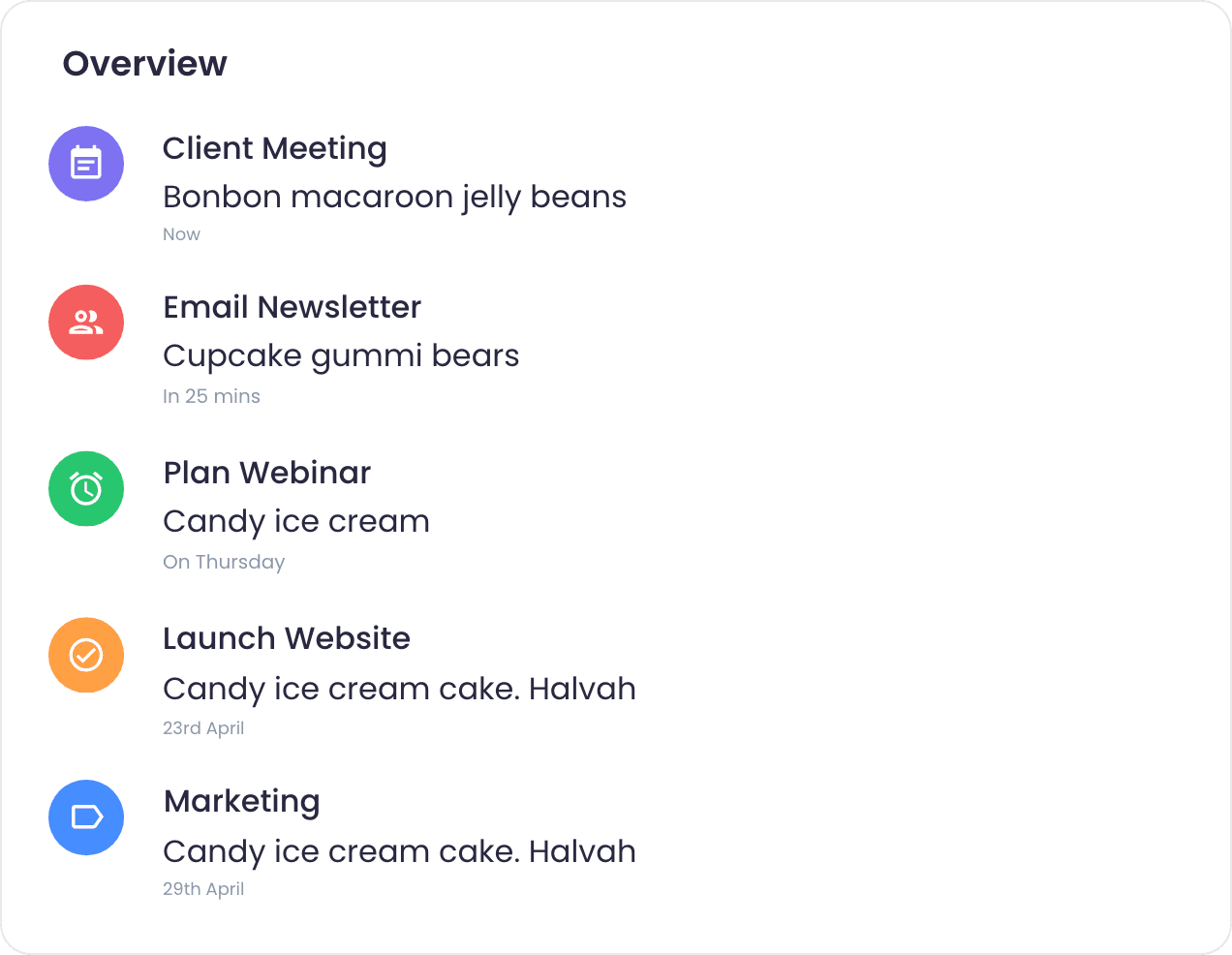
The everyday view, had plenty of tools on show for when on the phone, all being easy to reach.
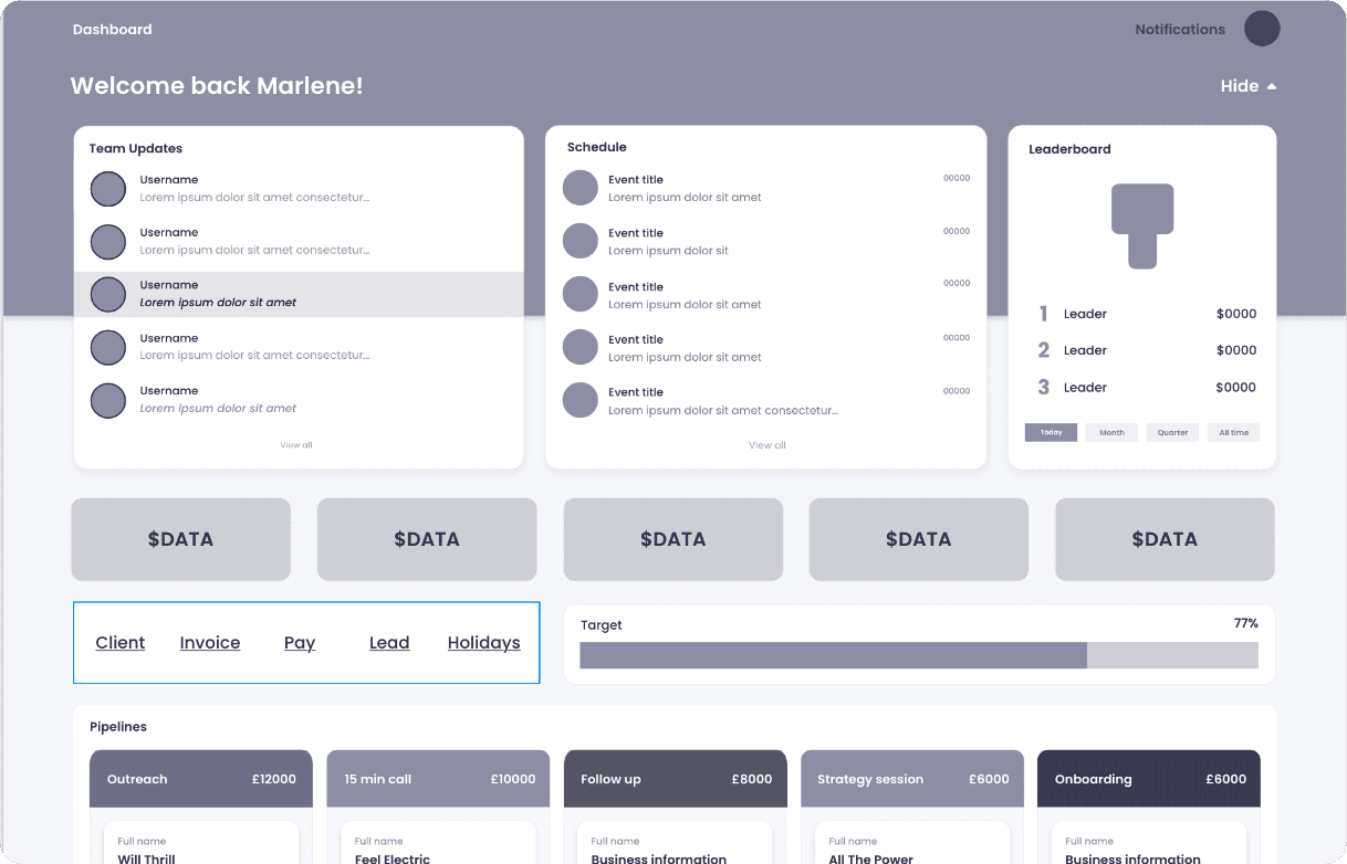
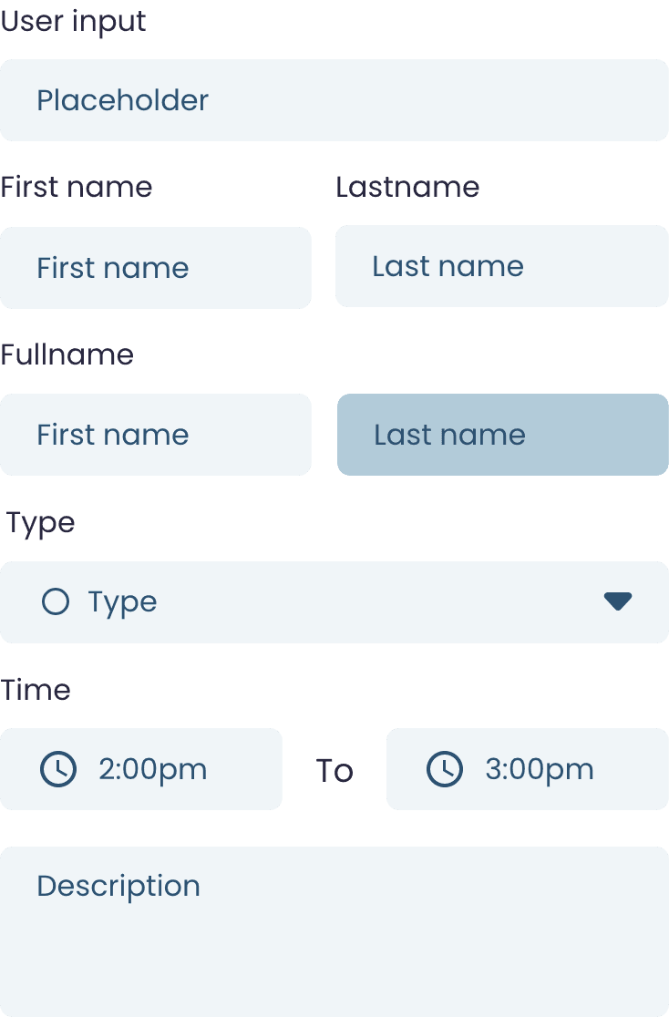
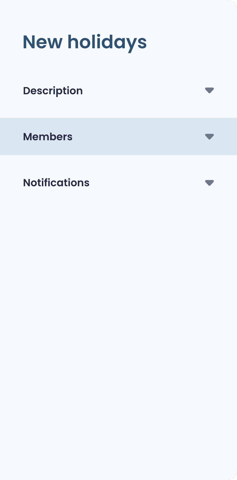
All form information is displayed with the left pane showing an overview no matter the tab the user is on.
When about to secure a deal, click the card. A window will appear with all the necessary tools.
When a deal is secured, dopamine is realised with a tick micro-animation.