
Recreating a digital magazine
for accountants
Croner- i
Croner- i

Overview
Accountancy Daily, once a market leader in print for financial professionals, faced potential closure as readership shifted to digital.
As one of two designers, I was brought in as a UX/UI lead to help reimagine the product. Working closely with product owners, stakeholders, and focus groups, we identified key user needs and delivered a refreshed vision that secured management buy-in and extended the life of the platform.

+25%
increase in digital engagement
232%
increase in Digital Subscribers
+58%
Increase in Monthly Viewers
35%
Longer Average Session Time
Feedback analysis
Feefo feedback over the last 2 years uncovered current pain points users face. The top 4 informed areas that needed the most attention and outlined areas to investigate further.
‘’To ensure the best outcome, we lay a foundation by’’
Trusted Customer
10 days ago
Customer Experience
‘’To ensure the best outcome, we lay a foundation by’’
10 days ago
Customer Experience
‘’To ensure the best outcome, we lay a foundation by’’
10 days ago
Customer Experience
‘’To ensure the best outcome, we lay a foundation by’’
Trusted Customer
10 days ago
Customer Experience

‘’The website is very text heavy, colour choices do not help’’
Trusted Customer
10 days ago
Customer Experience
‘’It is hard to navigate the site, I can not see the value’’
Trusted Customer
10 days ago
Customer Experience
‘’Looks outdated, especially compared to competition’’
Trusted Customer
10 days ago
Customer Experience
‘’Search is messy, no order to the results’’
Trusted Customer
10 days ago
Customer Experience
Persona
A once leader in print magazine for accountants, Accountancy daily was on the verge of being axed due to readers moving to a digital news. Us designers were tasked with bringing more value to the product. A team of 2, as a UX/UI designer,
A once leader in print magazine for accountants, Accountancy daily was on the verge of being axed due to readers moving to a digital news. Us designers were tasked with bringing more value to the product. A team of 2, as a UX/UI designer,
Bio
Account manager - 35 - career orientated
Arthur Thomas
Maintain profitability and business growth
Ensure compliance and adopt tools that support the firm
Define and uphold internal policies and practices
Strengthen his reputation with clients and peers
Keep the team aligned and well-trained without micromanaging
🎯 Goals
Discomfort with technology and fear of automation disrupting control
Constant pressure from client loss, profit concerns, and competition
Struggles balancing strategic leadership with team oversight
Difficulty ensuring high standards without direct involvement in daily work
Concern over protecting the firm’s reputation from errors or poor decisions
⚠️ Frustrations

Heuristic analysis
We analysed the website using personas to see issues first-hand whilst also uncovered areas to enhance from a designers perspective. A score was given for each section - the worst areas shaped the problem statements.
Overcrowded and lacks hierarchy — simplify to improve focus and reduce friction.
Opportunity to create deeper engagement by surfacing more from authors and related stories.
Cramped layout reduces usability — improve spacing to boost engagement.
Text-heavy with minimal engagement — lacks visual variety and clearer text hierarchy for scanning.
Dated colour and typography — needs modernisation for clarity and consistency.
Text-heavy layout overwhelms users — streamline copy for better readability, and reducing visual load on the user.
Adding more contextual links and articles can increase user retention and drive conversions.
Prominent placement isn’t essential for this context — could refocus attention on related content or exploration paths.
Ideation
Using all findings, problem statements were created to give focus when ideating.
I must be able to see the latest news without being overwhelmed so they can stay up to date.
1. Clarity in News Consumption
As a user that has seen enough news today, I must be able to clearly find a variety of useful content, so their membership is worth while.
2. Content Value Beyond Headlines
As a print magazine reader, Accountancy daily must feel welcoming for me when I first visit, Or I will go somewhere else.
3. Familiar & Welcoming Onboarding
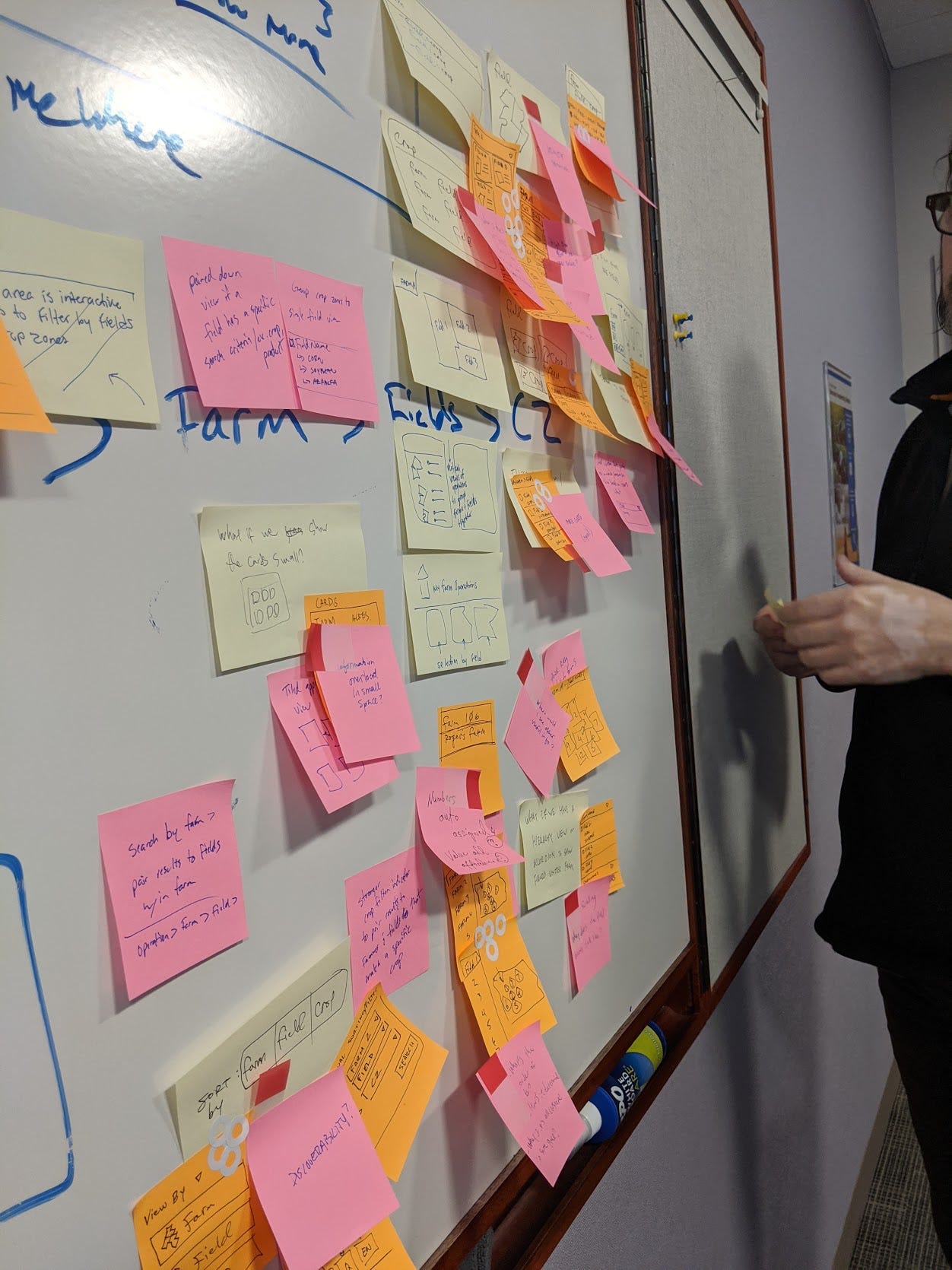
Brainstorming
We translated the problem statements into rapid ideas, captured on Post-it notes and grouped by theme to identify emerging feature patterns. This visual approach helped surface key opportunities, while lower-priority concepts were documented in our agile board for potential future releases.
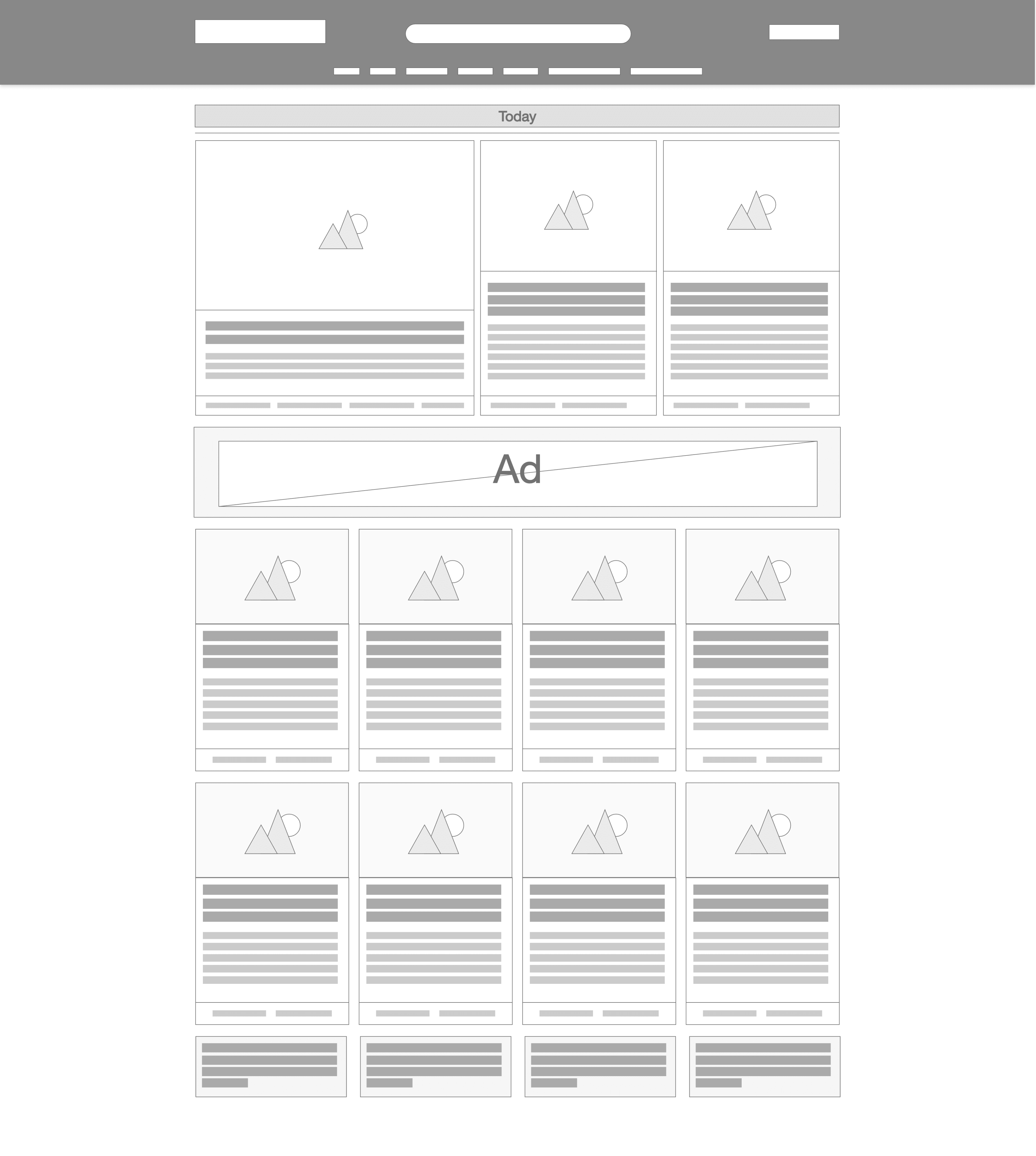
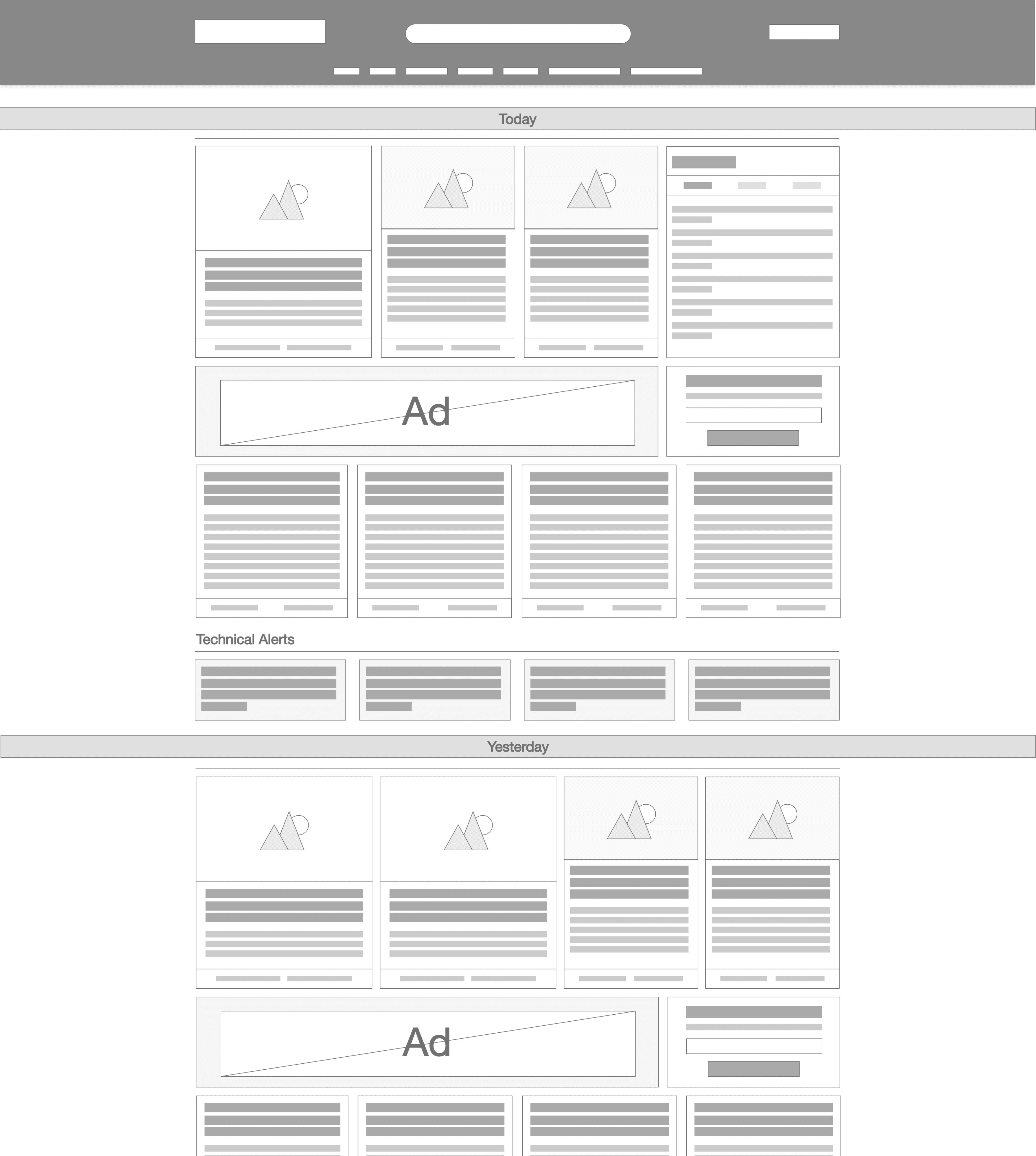
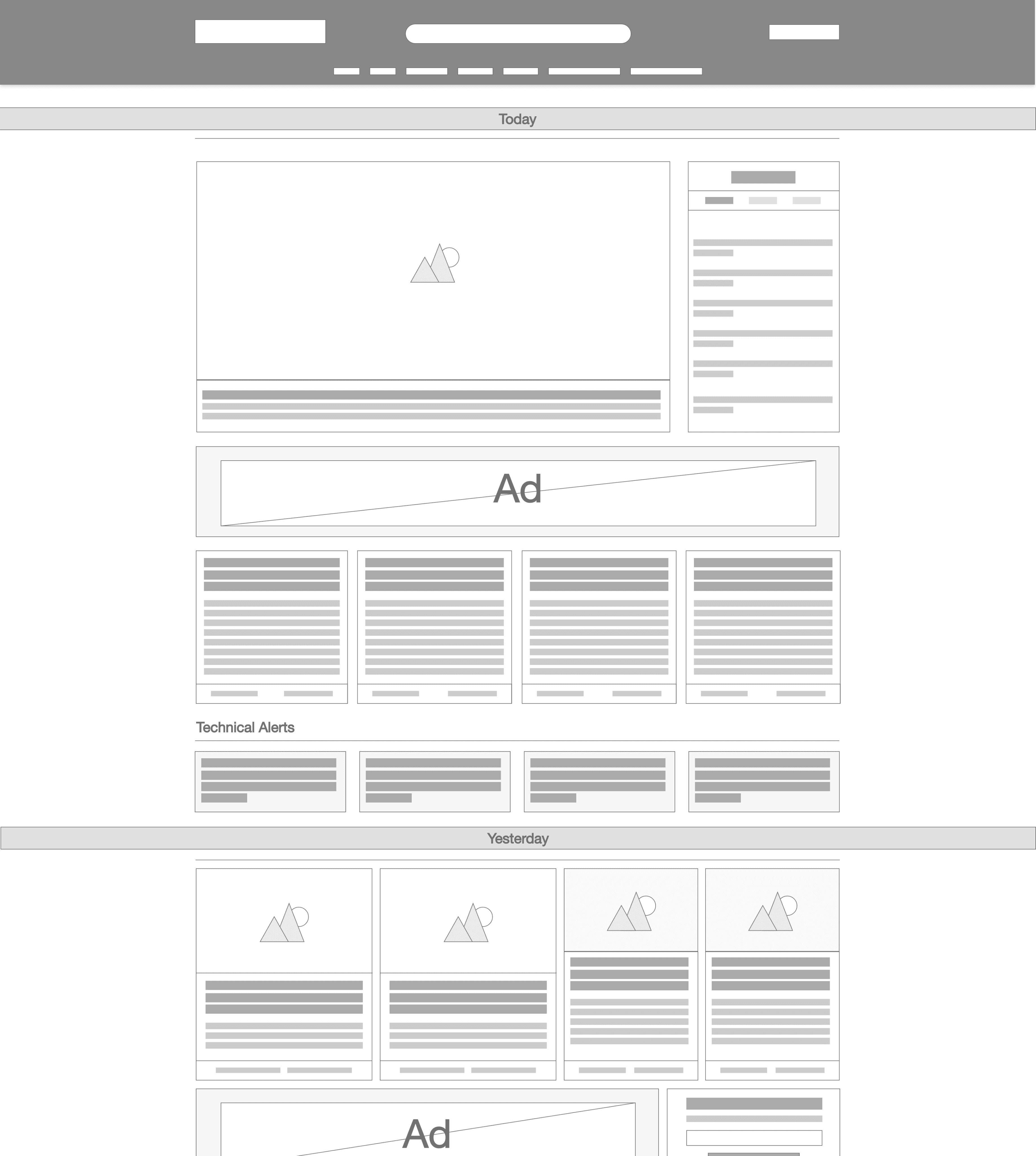
Wireframes
We created six low-fidelity wireframes to explore layout and flow variations based on user and business needs. These helped us gather early feedback and validate direction before moving into high-fidelity design.
Option 2
Option 3
Option 5
Option 6
User testing
Following internal reviews, the two strongest wireframe concepts were selected and presented to stakeholders for initial feedback and alignment. These concepts were then taken into moderated user testing sessions to evaluate usability, clarity, and relevance to real user needs. The insights gathered helped us validate assumptions, uncover unexpected friction points, and confidently shape the final design direction.
Option 1
Option 3
Option 2
Option 1
What worked well
• Clear 3-level content hierarchy made top stories easy to scan
• Large images helped set the scene visually
• Simple layout with minimal eye wandering
What didn’t work well in test
• 3 levels of hierarchy for seeing top stories
• Large images to set scene
• Easy to navigate, little eye wondering
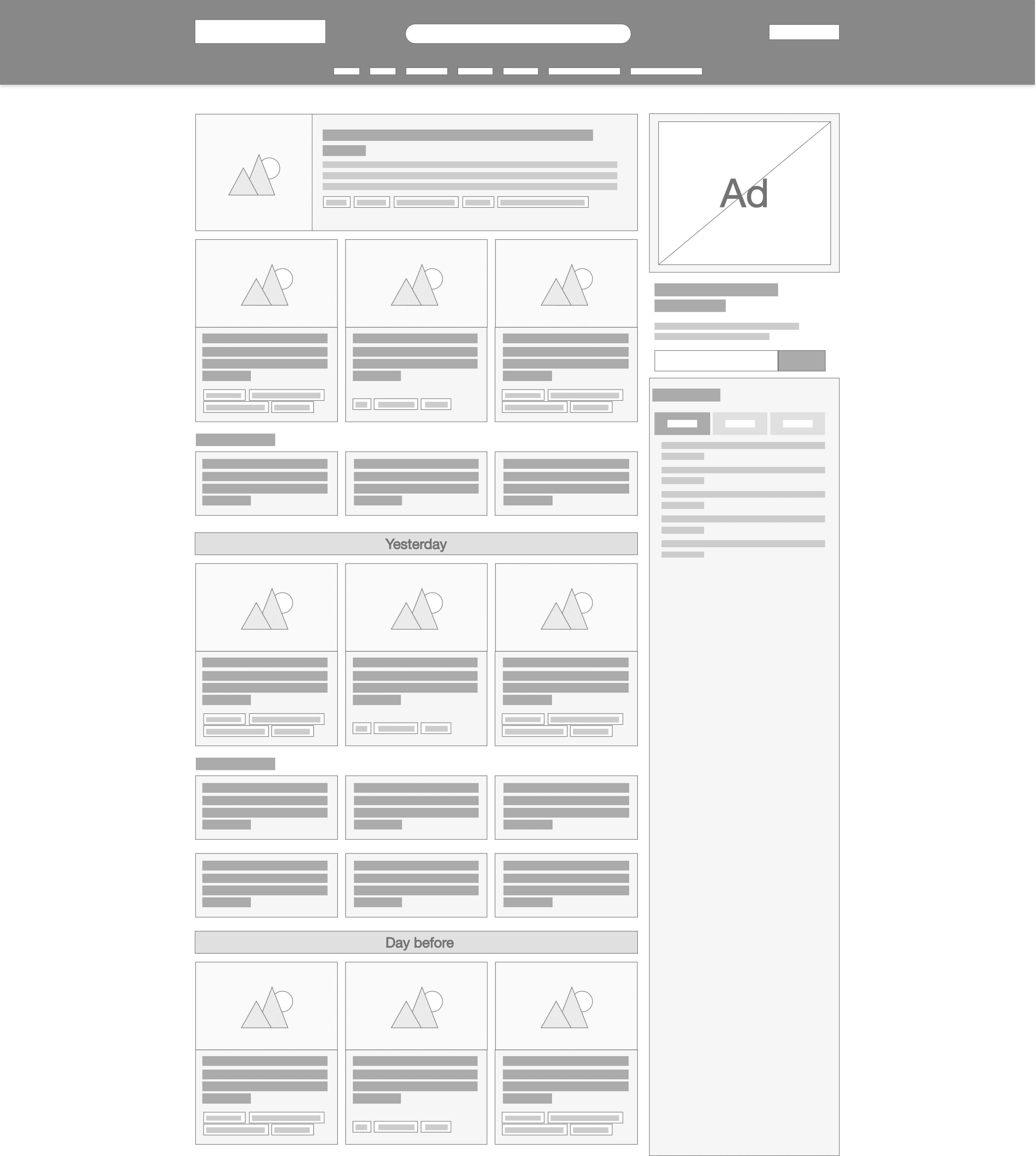
Finalised mockup
The results showed what the best outcome would be for both the user and the business. We refined this following further feedback tests, 3 amigo sessions and design best practices, this is the final mockup.
Design elements
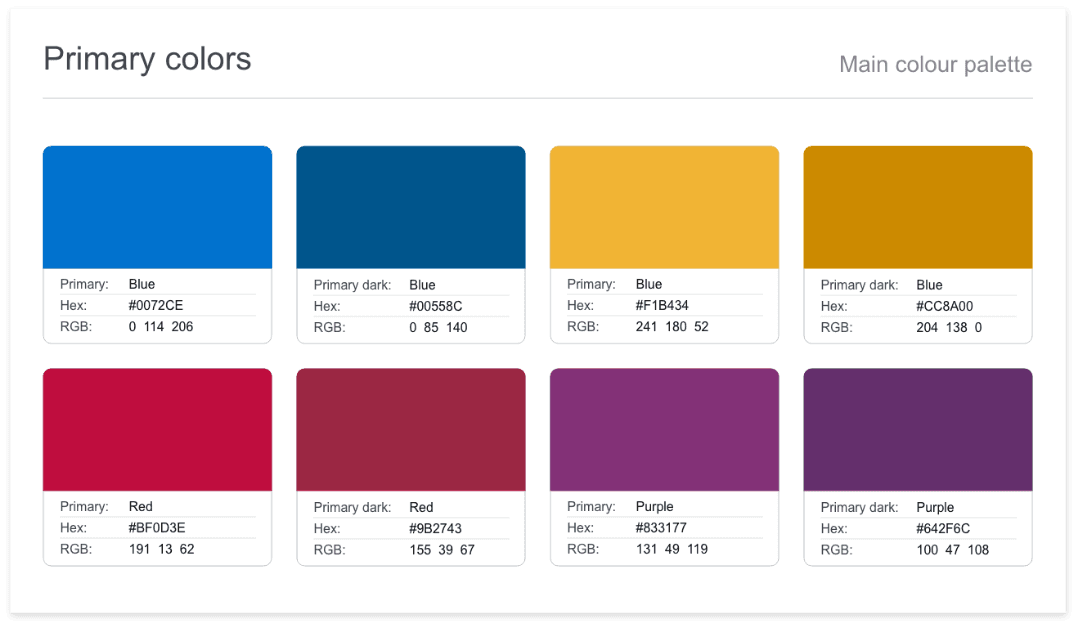
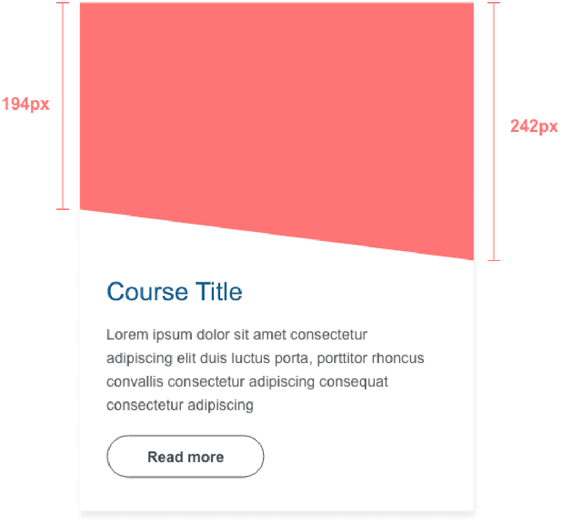
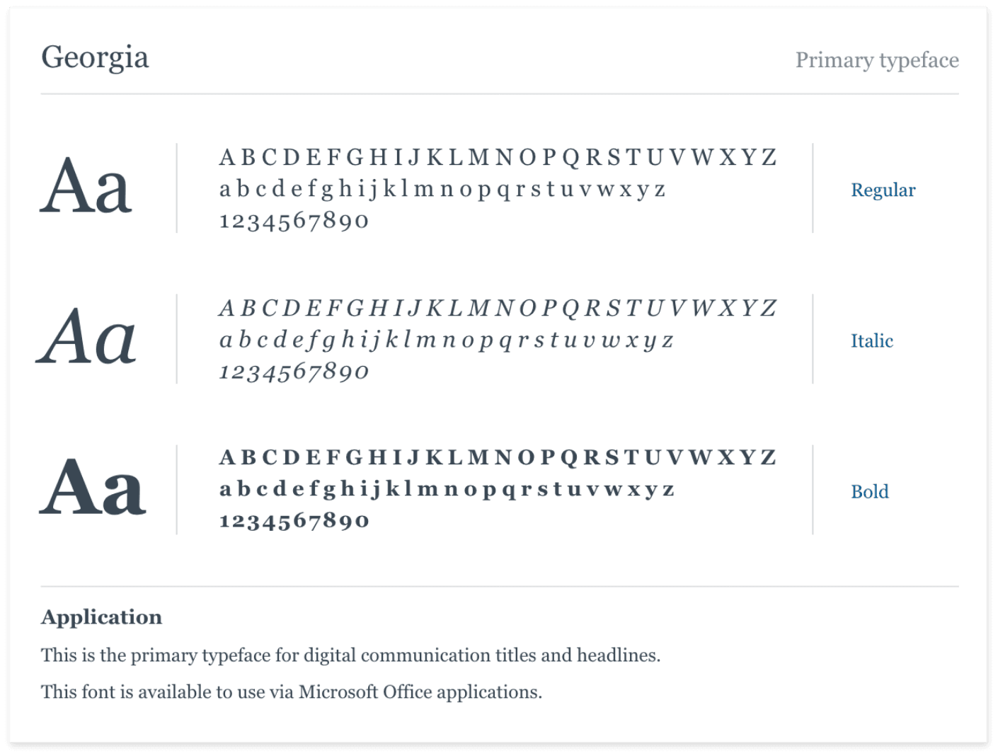
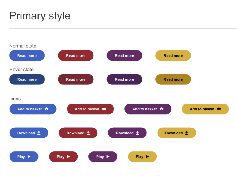
A design system was created to make all 5 Croner- I products coherent. We used this when designing, which sped up the process of design and development.
Colour
Cards
Cards
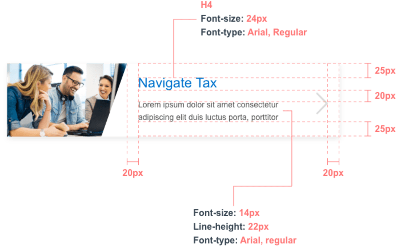
Text
Buttons
Menu
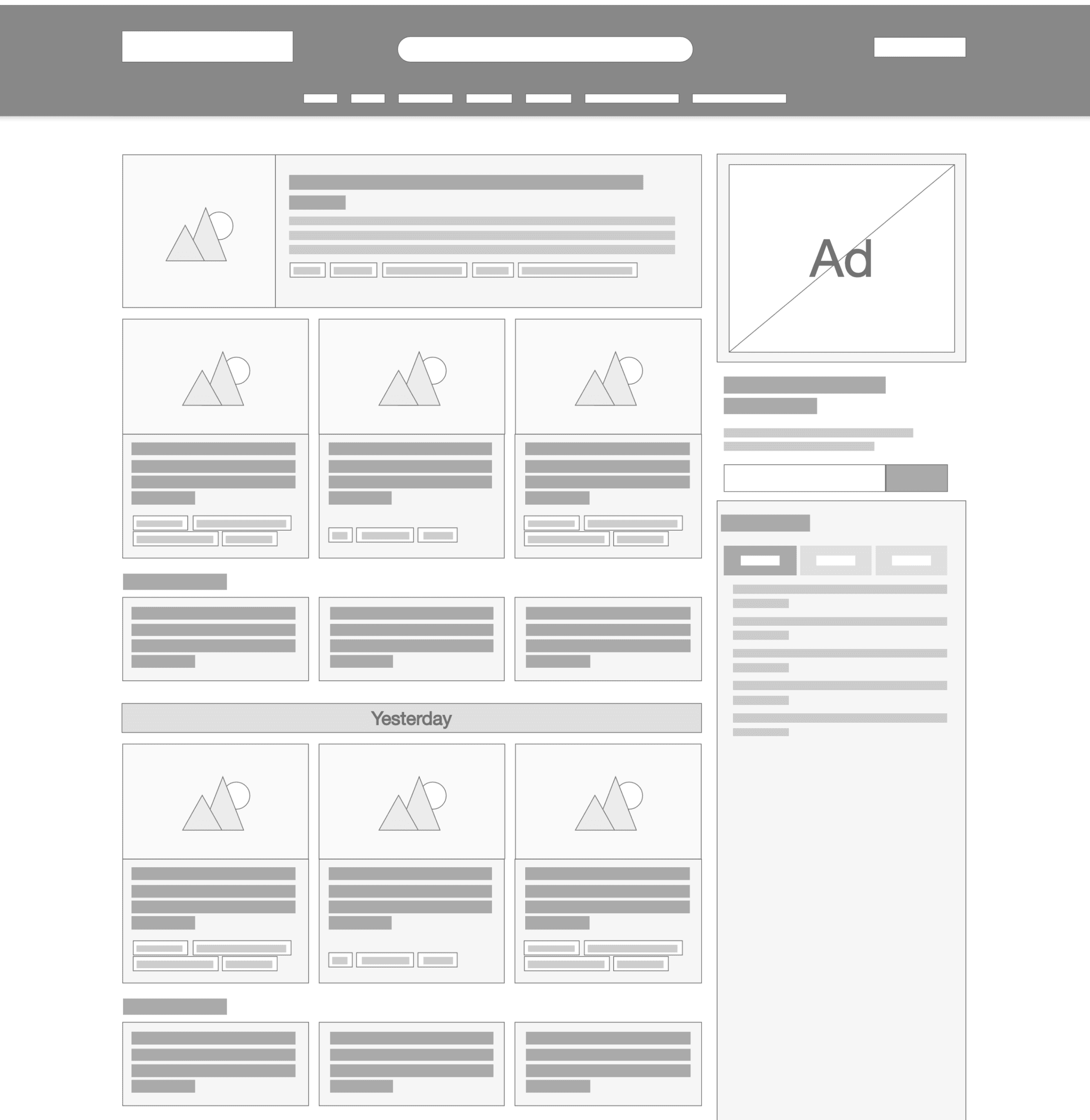
Final interface
The final prototype brought together all validated design decisions into a cohesive, user-centred interface. It was built to reflect real user flows, showcasing streamlined navigation, refined content hierarchy, and key features prioritised through stakeholder and user input. This clickable prototype was used to demonstrate functionality, gather final feedback, and guide development during handover.
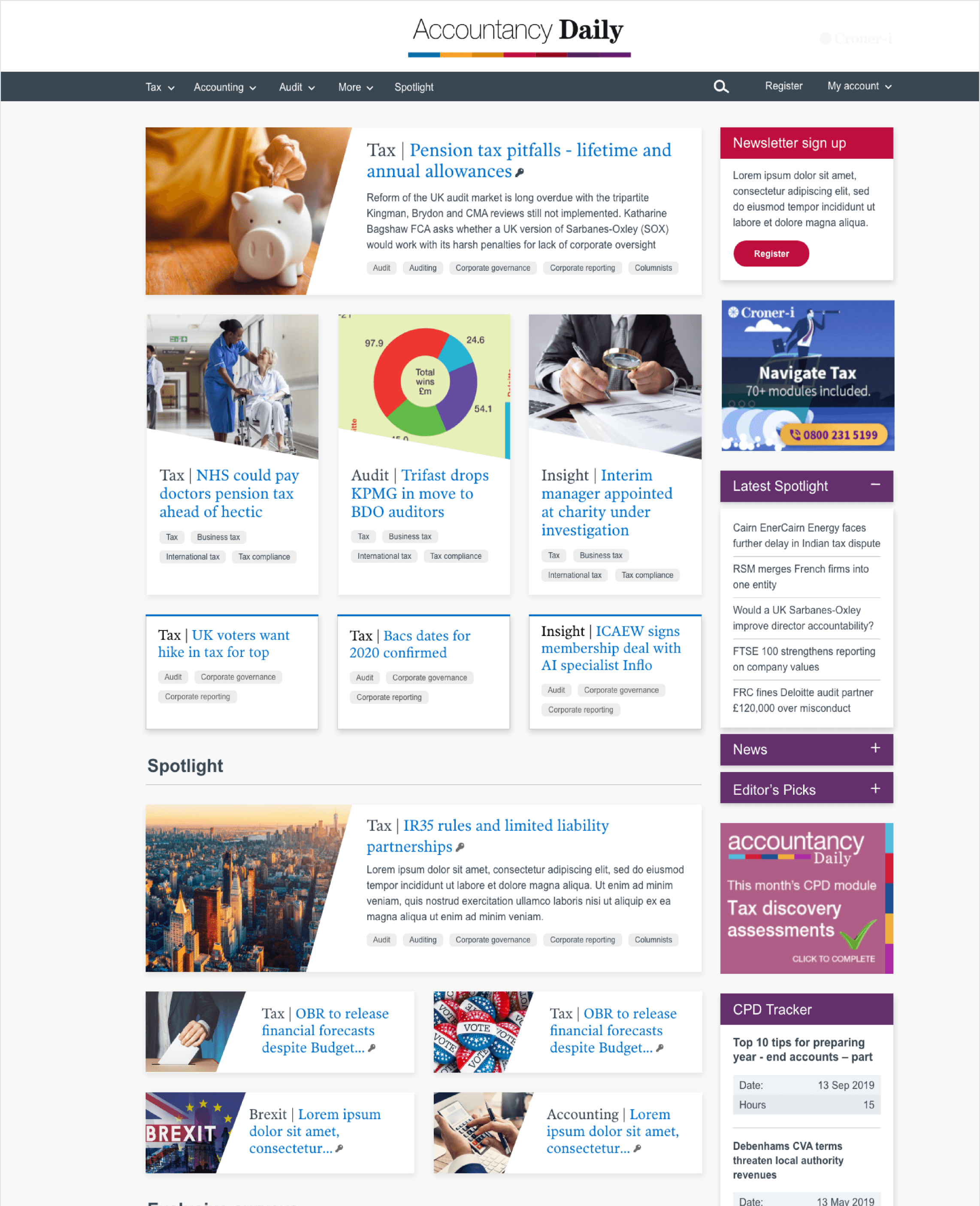
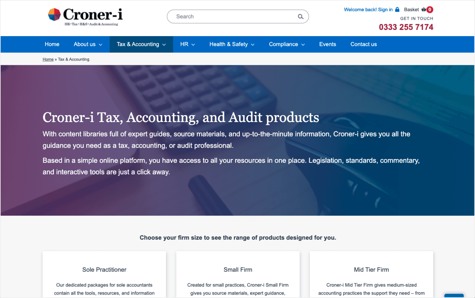
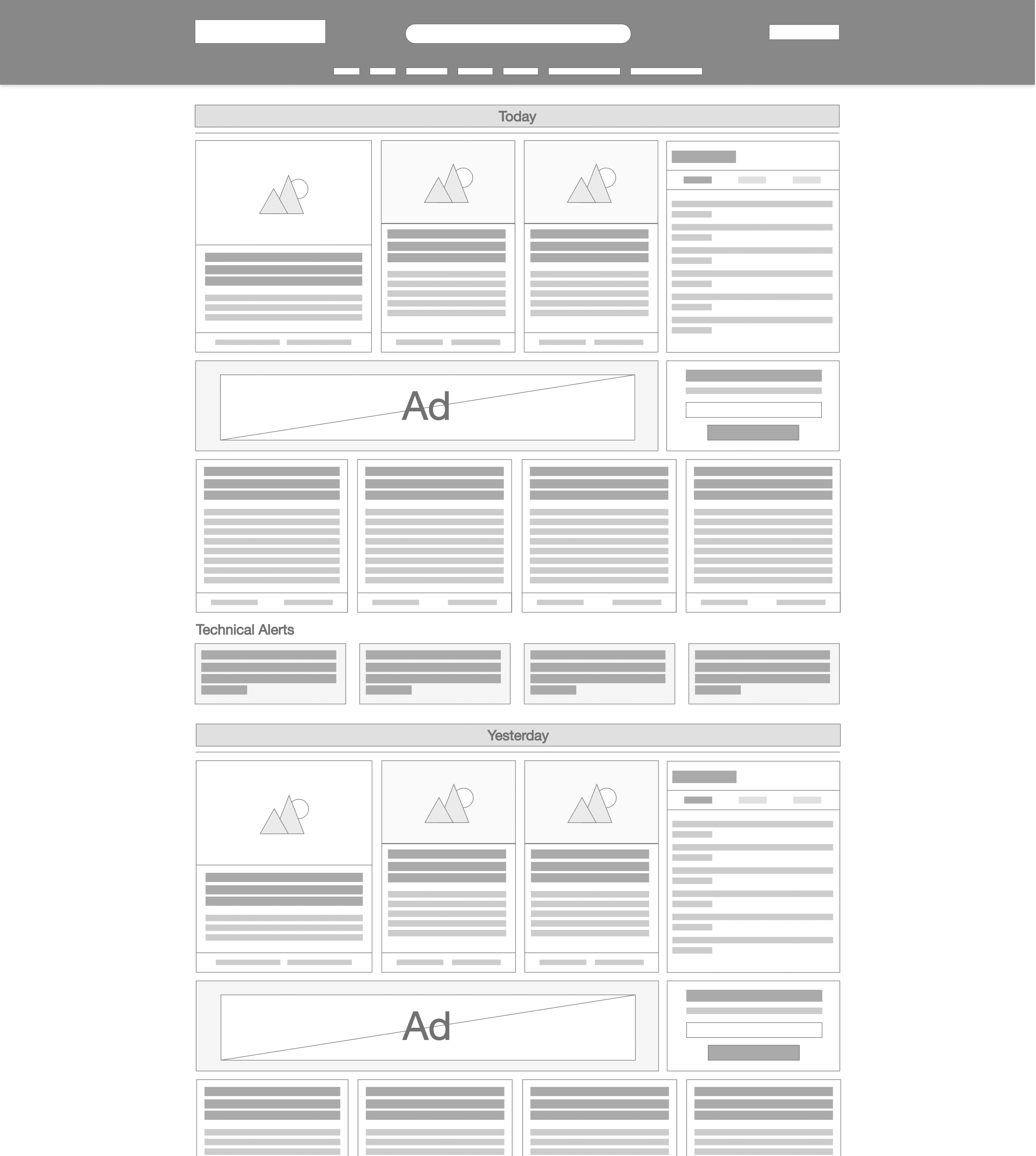
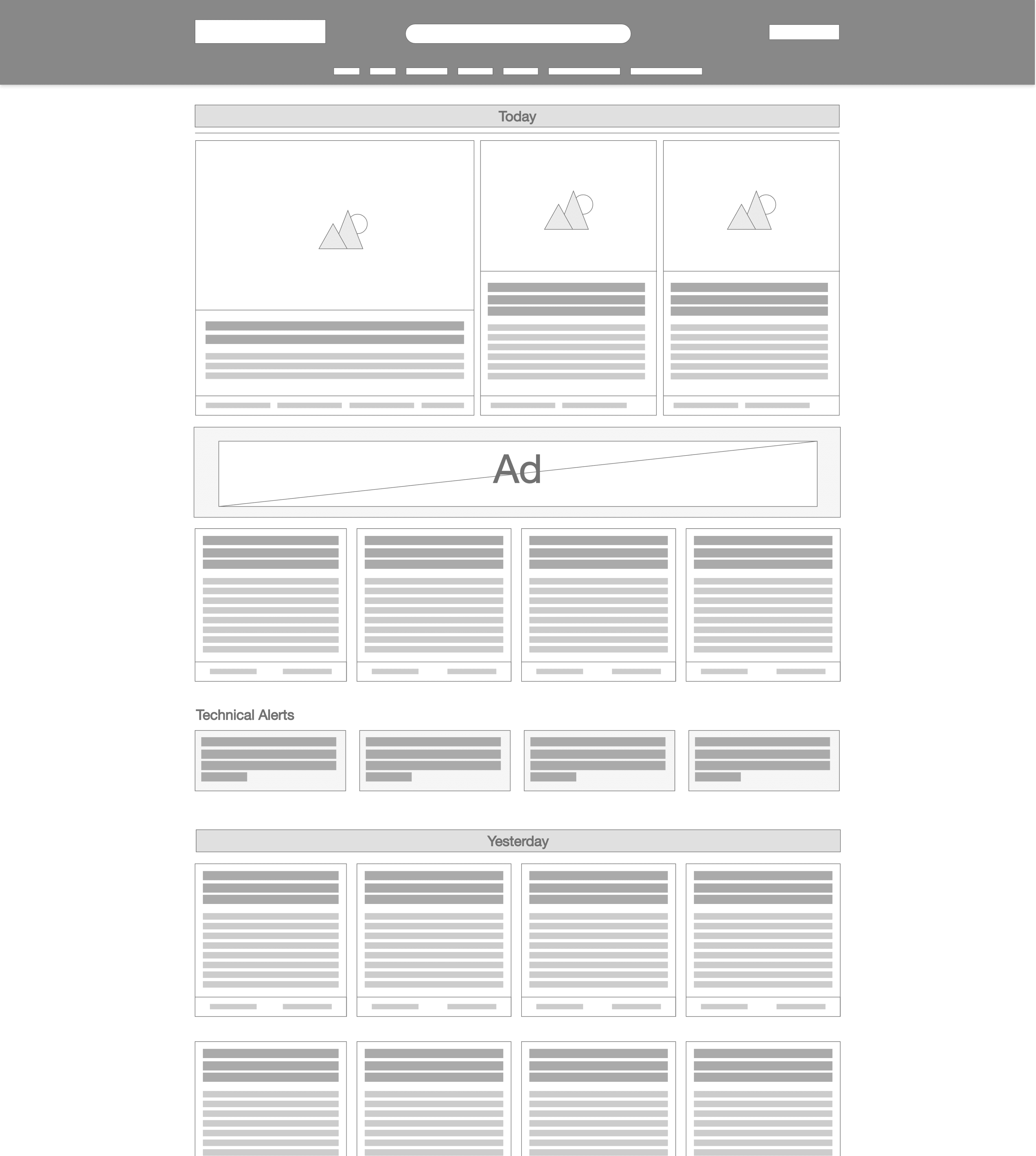
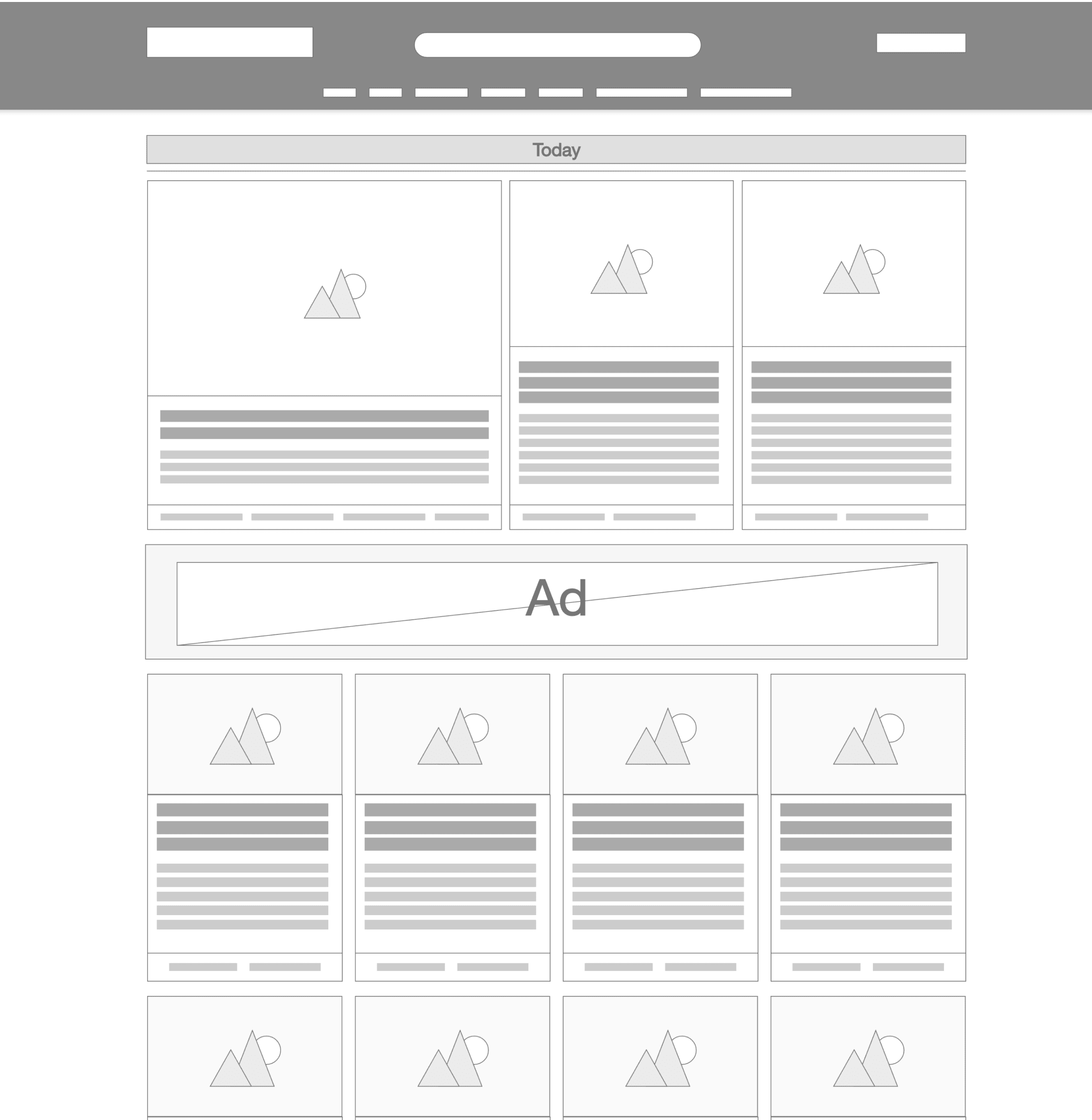
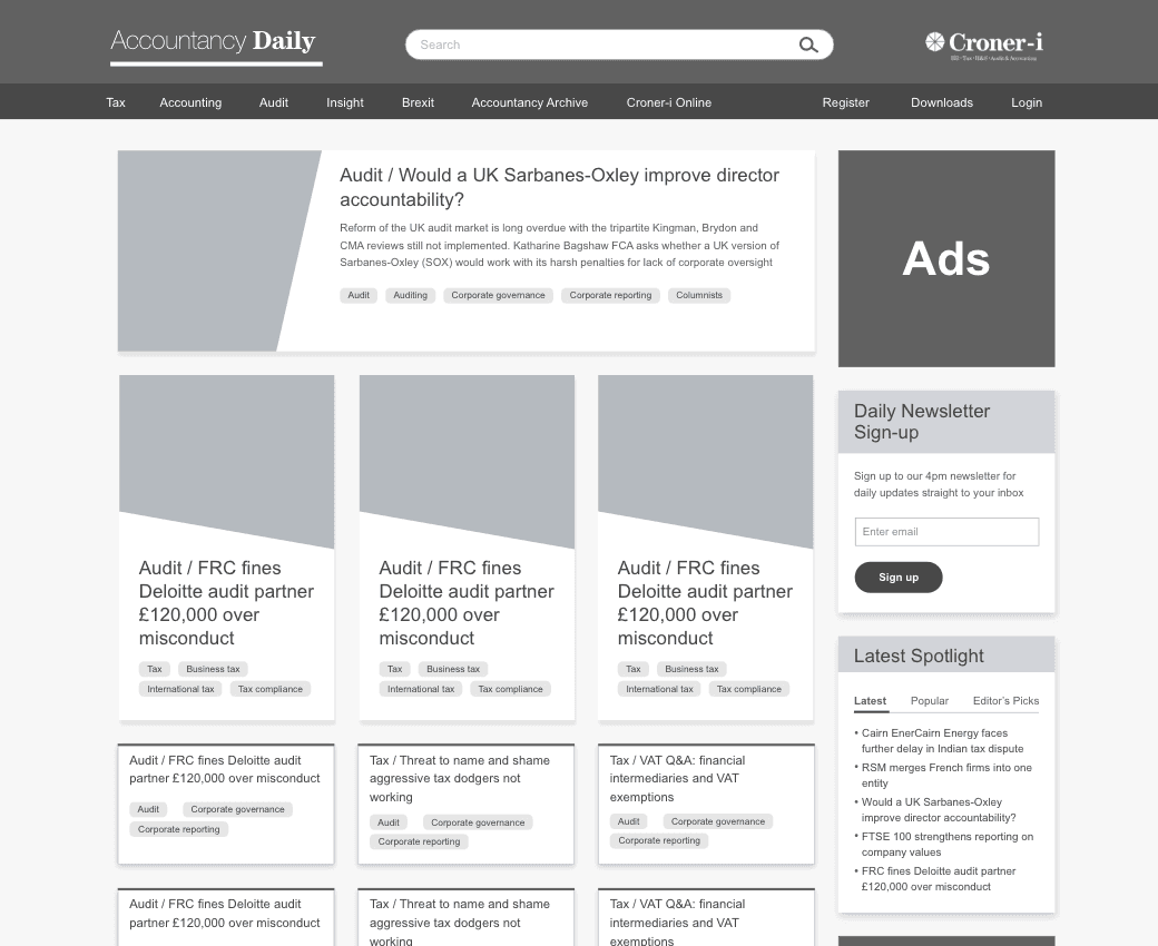
Before: The old website was text heavy, with little visual hierarchy.
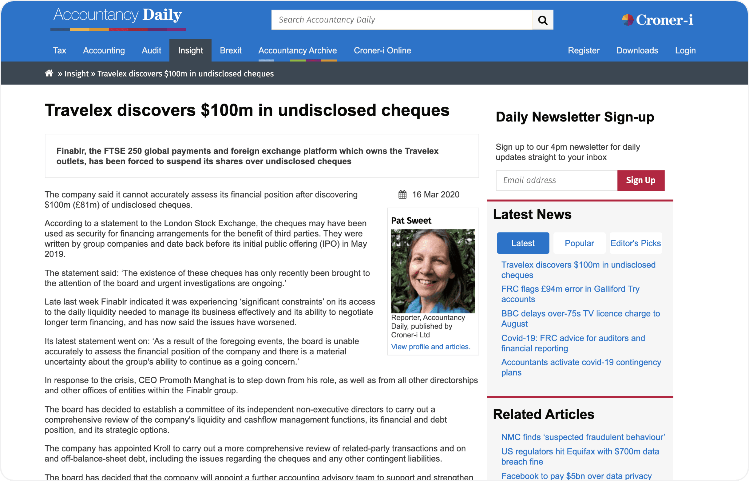
After: New cards and font weights, it is now apparent where content starts and ends.
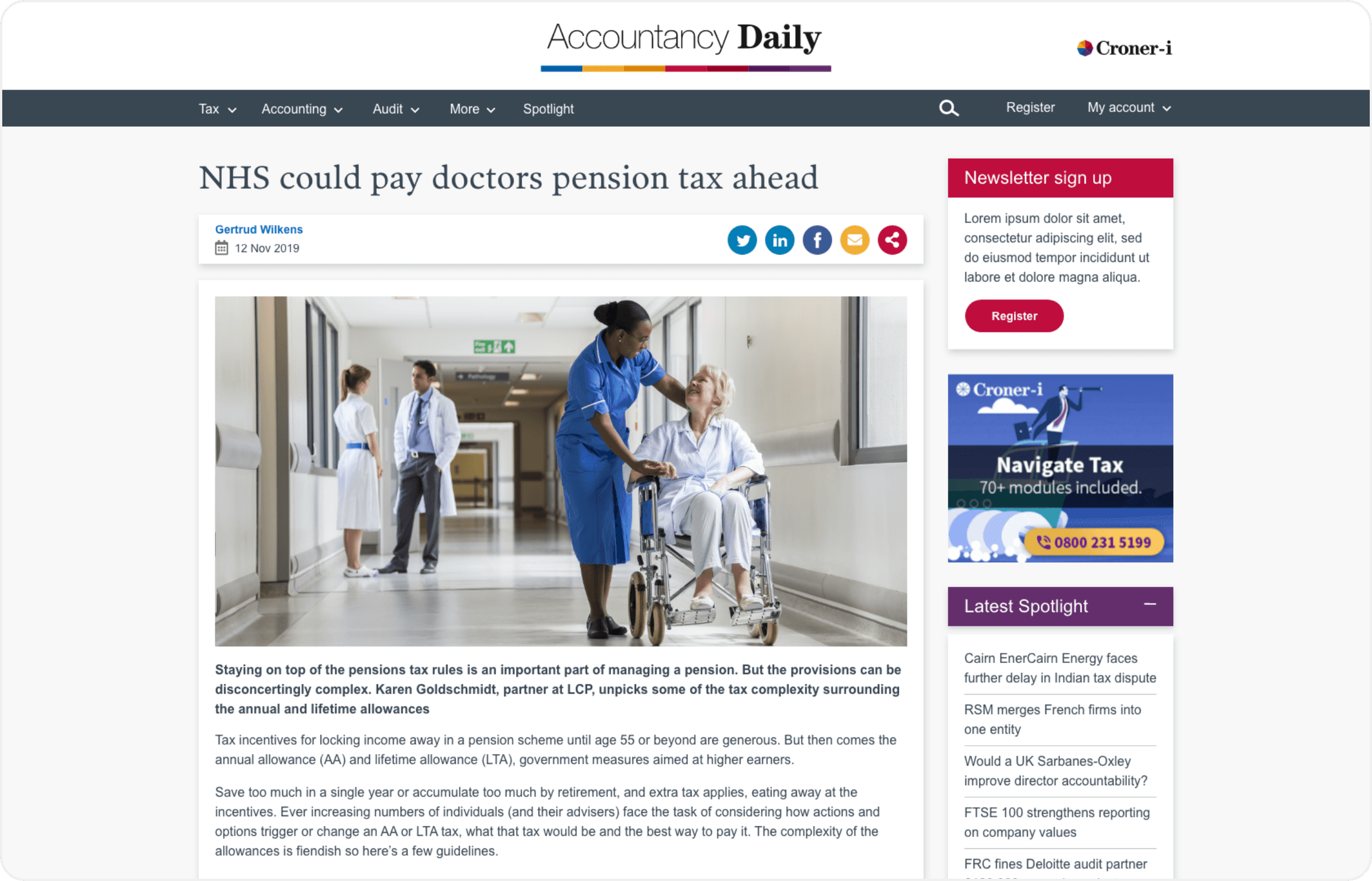
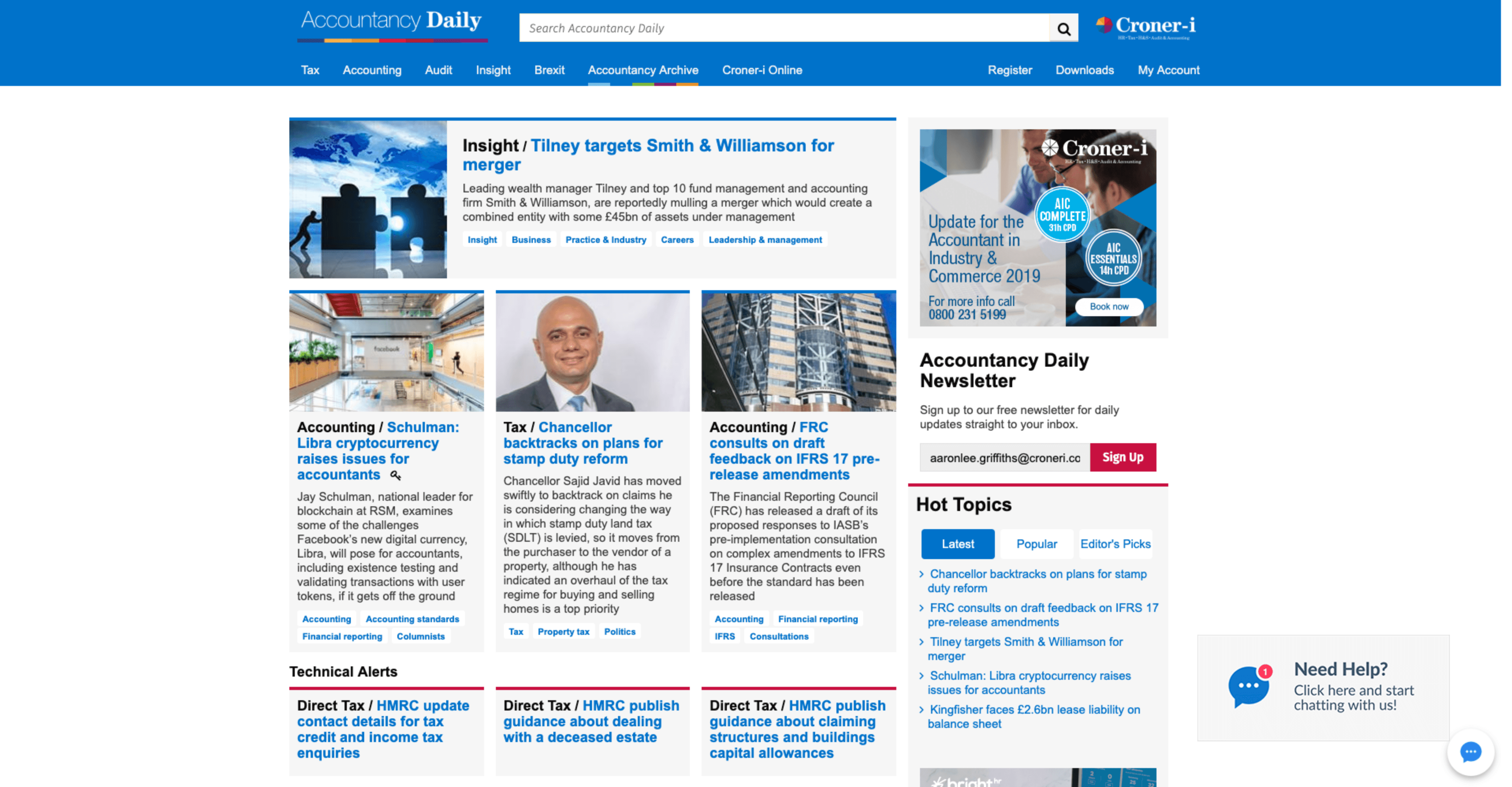
Before: A popular area has poor visual presence. there is no desire, to click links.
After: Each link is given visual presentation with a cover, bringing nostalgic value of a magazine which original users like.
Overview
A Redesign from the ground up was necessary, being from the ground up meant very heavy focus on the users and the desires they have. It was necessary to be strong communicator, to coordinate sessions, speak with stakeholders and give opposing evidence backed up by research. As a result an effective, aesthetic and usable product has sufficed, sure to keep users engaged while increasing retention.