A healthcare app used for documenting a personalised
medicine journey.
Autolomous
Overview
Autolomous is a biotech platform digitising the production of personalised medicine. I joined as the first UX/UI designer to transform an early MVP into a scalable, user-first product suite. Collaborating with stakeholders and scientists, I helped secure NHS funding and expand the platform globally.
£2M
NHS Funding Secured,
design lead to investment.
5>30
Team growth, helped scale the business rapidly.
from 1 product to launching 4 products.
4 products
Global
first launched in UK, scaled to 18 countries.
Product team
Delivery manager
Business analyst x3

Developers x4
Team structure
I joined Autolomous as the first in-house UX/UI designer, taking over from an external agency that created the MVP. As the product scaled and user feedback revealed key issues, I was brought in to lead a full redesign and rebrand — focused on improving usability, brand retention, and overall user experience. Below is the updated team structure after I joined.
UX/UI team
UX UI Designer

UX UI Designer

Junior UX/UI

QA

“We are struggling with utilisation, despite efforts users still preferred paper and pen. A redesign of the app was necessary”
Problem statement
A Previous look
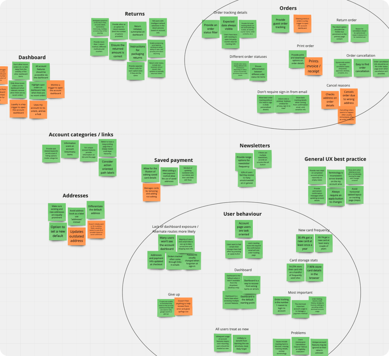
Feefo feedback over the last 2 years uncovered current pain points users face. The top 4 informed areas that needed the most attention and outlined areas to investigate further.
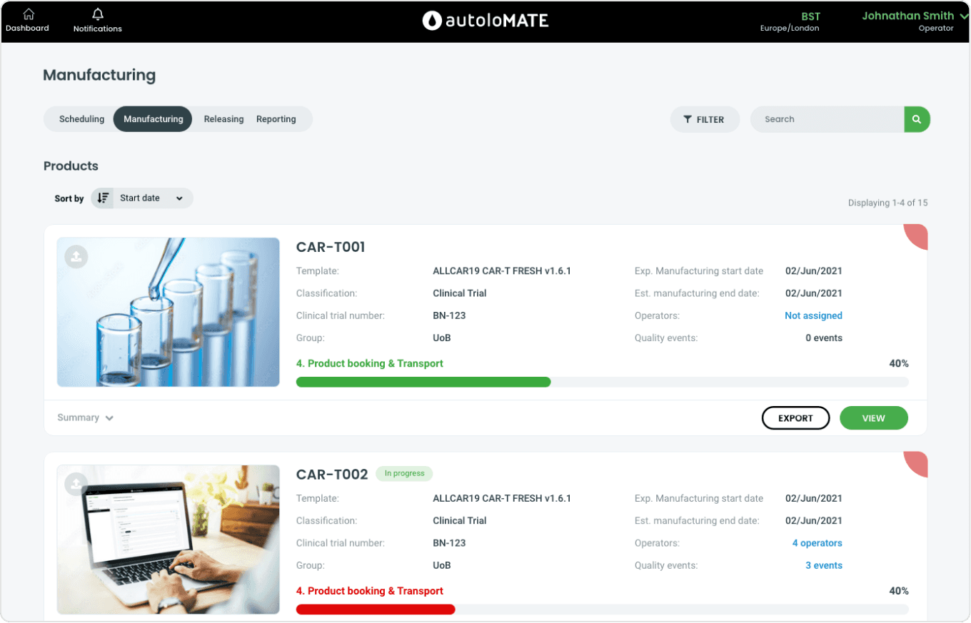
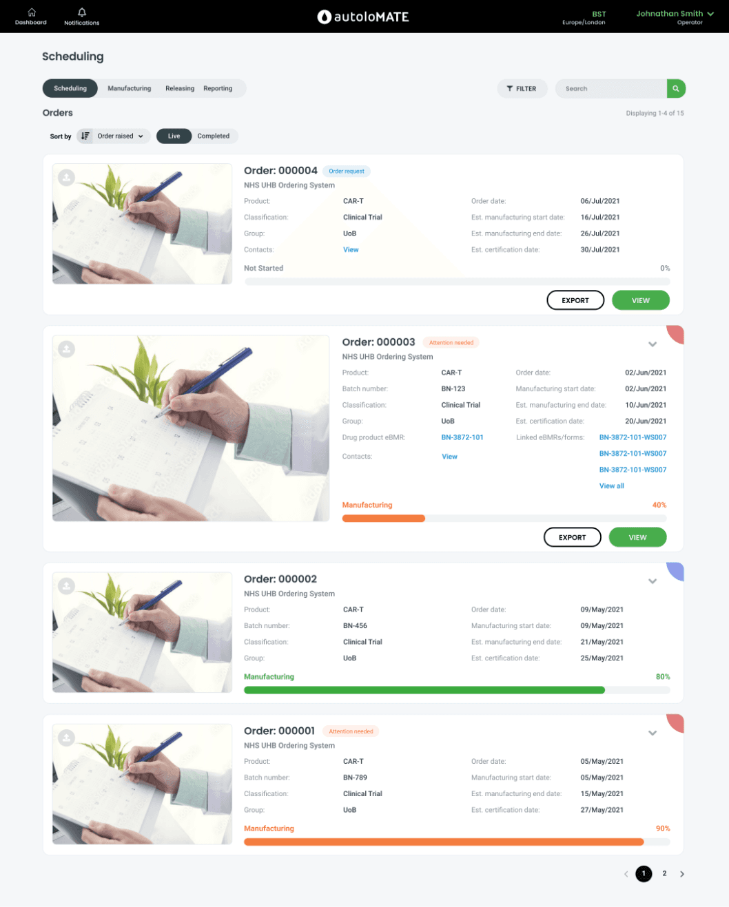
Screen Phsyician sees when they log in for work
This serves as a dashboard, showing all personised treatment task flows, how far along they are and which one needs most attention.
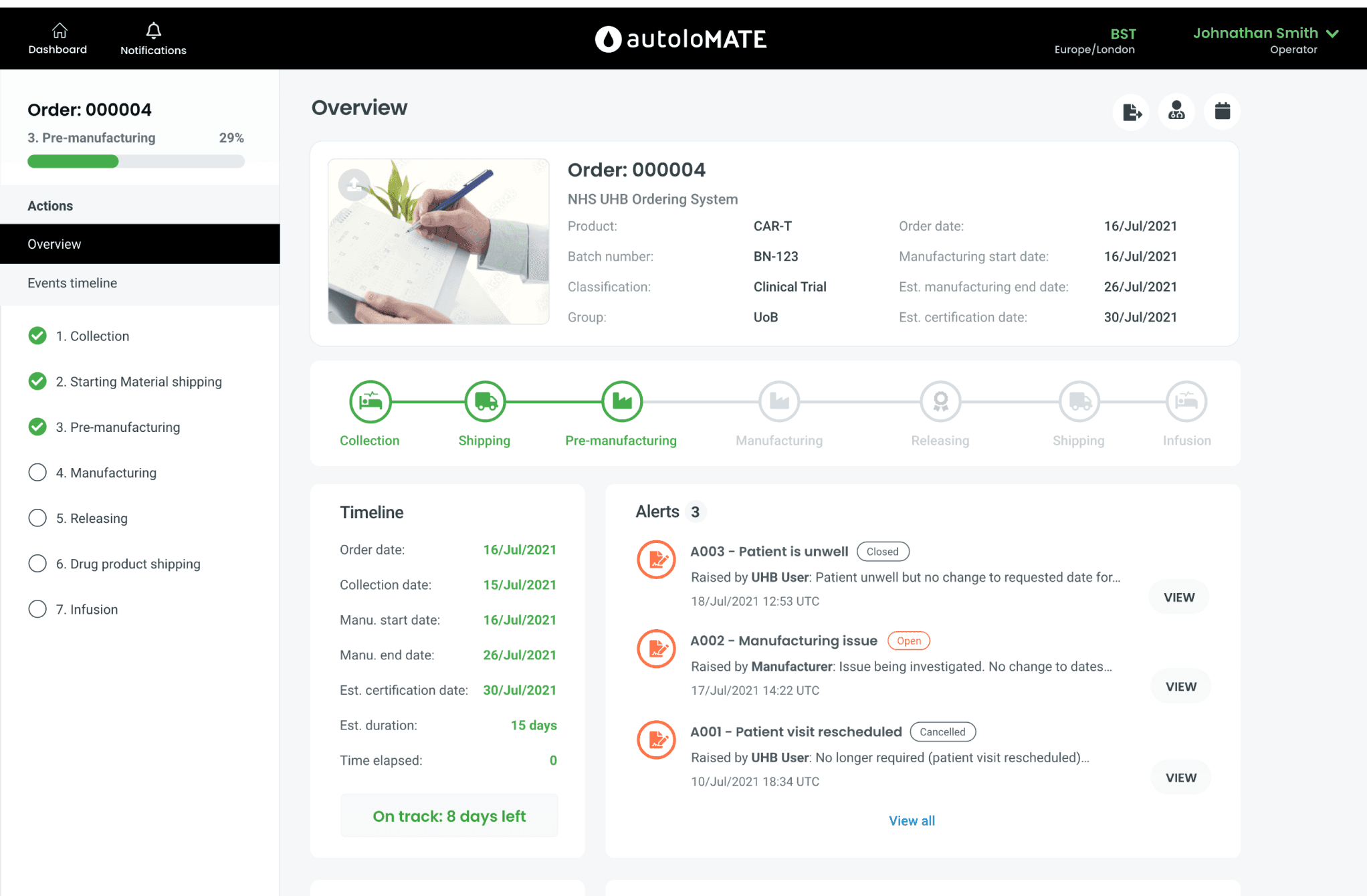
Inside of a personalised medicine taskflow
As the medicine is produced a physician will check off each task as they complete a task.
Description: Information heavy - has no hierachy, not clear where to look
Solution: New approach with progress bar with labels.
Description: Icons are forgetful
Description: Not clear what function does or means, hard to learn
Solution: Minimise size, add more value to user.
Description: Nav is large, and not useful
Solution:Use colour to indicate issues/status
Description: Icons are hard to learn
Solution: Keep a fixed message at top to keep the purpose clear.
Description: Inconsistant fields, Box vs underline
Solution: Single menu with settings and personal items within.
Description: Icons and tabs are ambiguous and is not apparent.
Description: Search and filter unnecessarily large.
Description: Button does not pass accessibility test. Primary should be furthest to right
Significant painpoints
Feefo feedback over the last 2 years uncovered current pain points users face. The top 4 informed areas that needed the most attention and outlined areas to investigate further.

I have been working for **** for over 25 years, when I started all was done on paper. We tried out a few digital platforms and
saw the benefits - now we want to go for the full package..
Bio
Access accurate data anytime, anywhere
Link deviations to external systems
View root cause at release points
Check training and equipment summaries
Quickly review contextual eBMR data
Confirm product compliance with ease
Spot value changes and OOS issues fast
🎯 Goals
Difficult to review deviations as I have to manually look through paper
documents
Can not easily trends in deviations when using paper
Security is a concern, do not like having data at risk
⚠️ Frustrations
In-house Qualified person - 53
Marcia Thomas
Personas were created to would keep us grounded. With a niche demographic it was essential to note all aspects of the users personality in order to create a product that fits the requirements while being easy to use.
Persona
Ideation
During ideation, we focused on translating complex offline workflows into a digital-first experience that felt intuitive to lab and quality teams. Through workshops, whiteboarding sessions, and rapid sketching, we explored ways to surface critical data at the right moments, minimise user error, and support compliance. Concepts were prioritised based on feasibility, regulatory alignment, and user feedback gathered during early validation.

Final interface
The final prototype brought together all validated design decisions into a cohesive, user-centred interface. It was built to reflect real user flows, showcasing streamlined navigation, refined content hierarchy, and key features prioritised through stakeholder and user input. This clickable prototype was used to demonstrate functionality, gather final feedback, and guide development during handover.
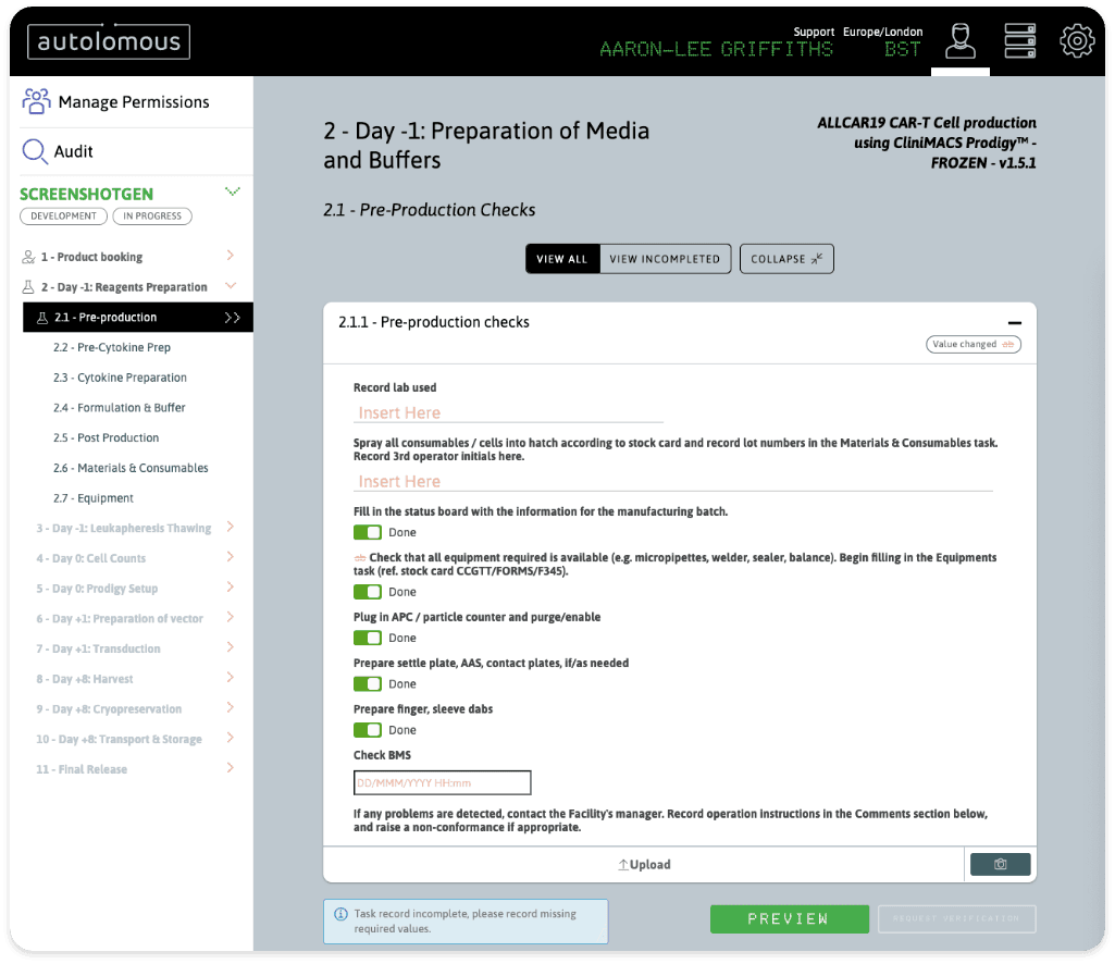
Graphics have been introduced to make the app easy to gage. Reducing the need for heavy text.
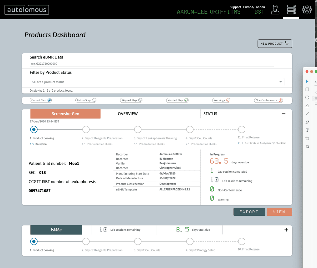
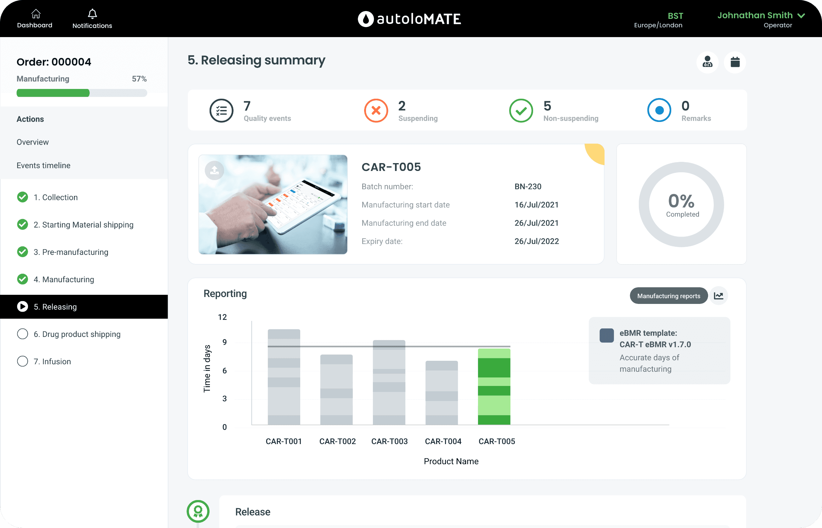
When the user clicks In they see an overview of how the development is going. On the right they see a helpful checklist
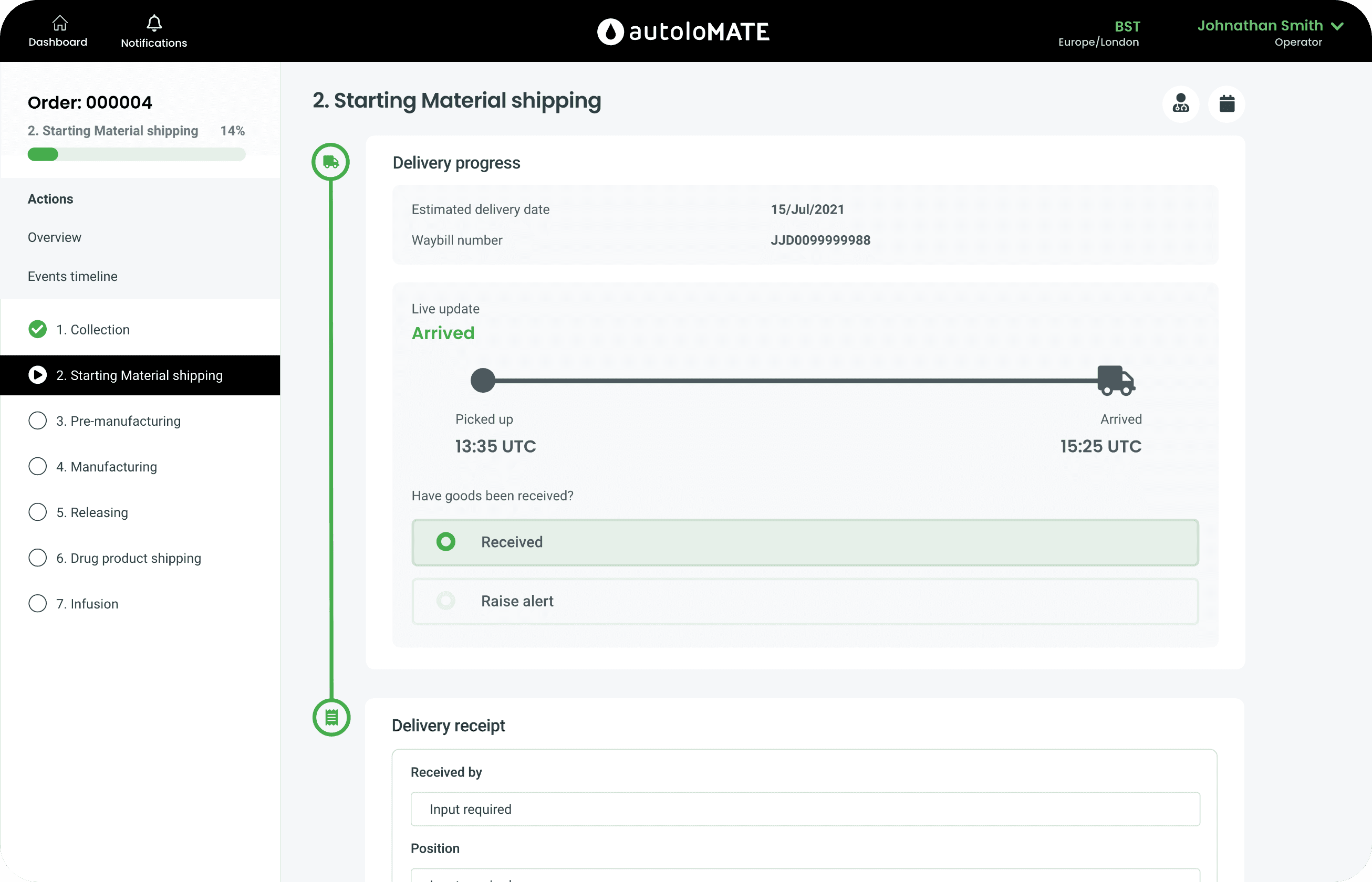
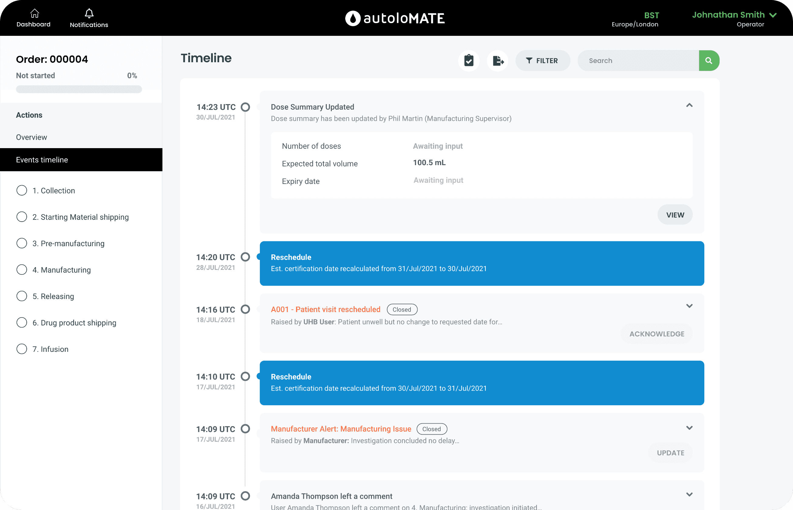
A timeline of events is an alternative way of seeing development. Here they can see what was done and at at what time.
A timeline of events is an alternative way of seeing development. Here they can see what was done and at at what time.
Overview
A Redesign from the ground up was necessary, being from the ground up meant very heavy focus on the users and the desires they have. It was necessary to be strong communicator, to coordinate sessions, speak with stakeholders and give opposing evidence backed up by research. As a result an effective, aesthetic and usable product has sufficed, sure to keep users engaged while increasing retention.